
On March 29, 2025, Professor Stephen Pasqualina and the students in his Winter 2025 Black Modernisms course visited the Detroit Institute of Arts (DIA). The class came to the DIA with the intention of touring two adjacent sections of the museum: one labeled “African American,” the other labeled “Modern.” Students were to peruse these two sections and then complete a side-by-side comparison of two works of art, one from each section.
But when they got to the museum, they hit a snag: part of the Modern section and all of the African American section had been recently closed for renovations.

And so they shifted gears: they compared the Modern section (which features works of European and white US-American artists of the twentieth century) with “Contemporary” rooms that feature the work of Black artists. These rooms include the “Tiff Massey: 7 Mile + Livernois” exhibit and works from the Nancy and Sean Cotton Collection (labeled “Asserting Black Humanity”), which includes work by artists from the US, Ghana, and Nigeria.
The goal of this assignment was to have students consider how the terms “African American” or “Black” stand in relation to the terms “Modern” or “Modernism.” As you will see below, some witnessed deep resonances across these categories, while others noted stark differences, often accentuated by the DIA’s descriptions of the works of art.
The students’ findings tell a story about the design of art institutions and academies of knowledge. It turns out that acts of categorization shape what we see—or what we’re told to see.
WILEY / BONNARD

By LAURYN McDOUGAL
Kehinde Wiley’s works of art are very vibrant and striking, with colors that radiate from his impeccable oil-painting technique. Featured in the “Asserting Black Humanity” section of the DIA, Untitled (Copley) (2022) features many important details, such as the light bouncing from the clothes and the use of vivid color, especially when rendering the skin of his subjects. This painting is supposed to be based on the 18th-century painting Watson and the Shark (1778) by John Singleton Copley.
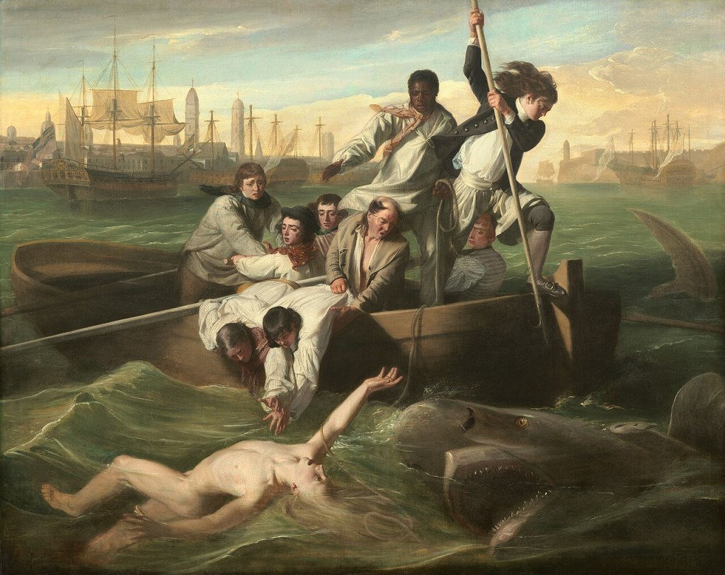
When comparing the two, I immediately noticed how the subjects of Wiley’s painting were positioned differently. While in Wiley’s painting the women are still fighting that same shark featured in Copley’s, I noted that they were kind of “detached,” staring straight at the viewer. They are not “in” the scene, as if they are aware they are in a painting and not too terribly concerned with the situation unfolding around them. I also thought it was interesting Wiley decided to use Senegalese women in particular, though it is explained that he wanted to include more diversity in art. I also wonder why he decided to dress them in plain, modern clothing.

Hanging in the Modernist wing of the museum, Pierre Bonnard’s Woman with Dog (1924) takes on a “hazier” look compared to Wiley’s vivid colors and clear-cut shapes. Bonnard’s piece is more textured and two-dimensional, and the subject and background of the painting took me a second to register. Unlike the subjects in Wiley’s painting, who are acutely aware of the viewer, Bonnard’s subject is completely focused on her dog, and it feels like a still painting. The shapes within the piece are also very jewel-like as the description points out, and the colors feel a bit muted.
I’ve noticed that artists of color have a sort of social specter hanging over their head whenever they decide to produce a piece. They cannot always simply indulge in creation; their paintings must have some sort of commentary attached to them, usually pertaining to an aspect of their identity, compared to European Modernist artists who can create art that does not address the collective.
I believe Clement Greenberg’s essay “Modernist Painting” breaks this phenomenon down best: “The immediate aims of Modernist artists remain individual before anything else, and the truth and success of their work is individual before it is anything else. To the extent that it succeeds as art Modernist art partakes in no way of the character of a demonstration” (9).
I think this is interesting because as I was touring both sections, I noticed that in the Modernist area, descriptions of the paintings focused on technique and expression before any comments on the social implications of the piece. Unfortunately, we were not able to explore the African American section of the museum, so maybe the descriptions would have been similar, but I did notice how the individual came before the collective in a lot of Modernist pieces compared to the African American pieces.
HAMMERSHØI / OLUWASEUN
By JOSHUA OTTEN
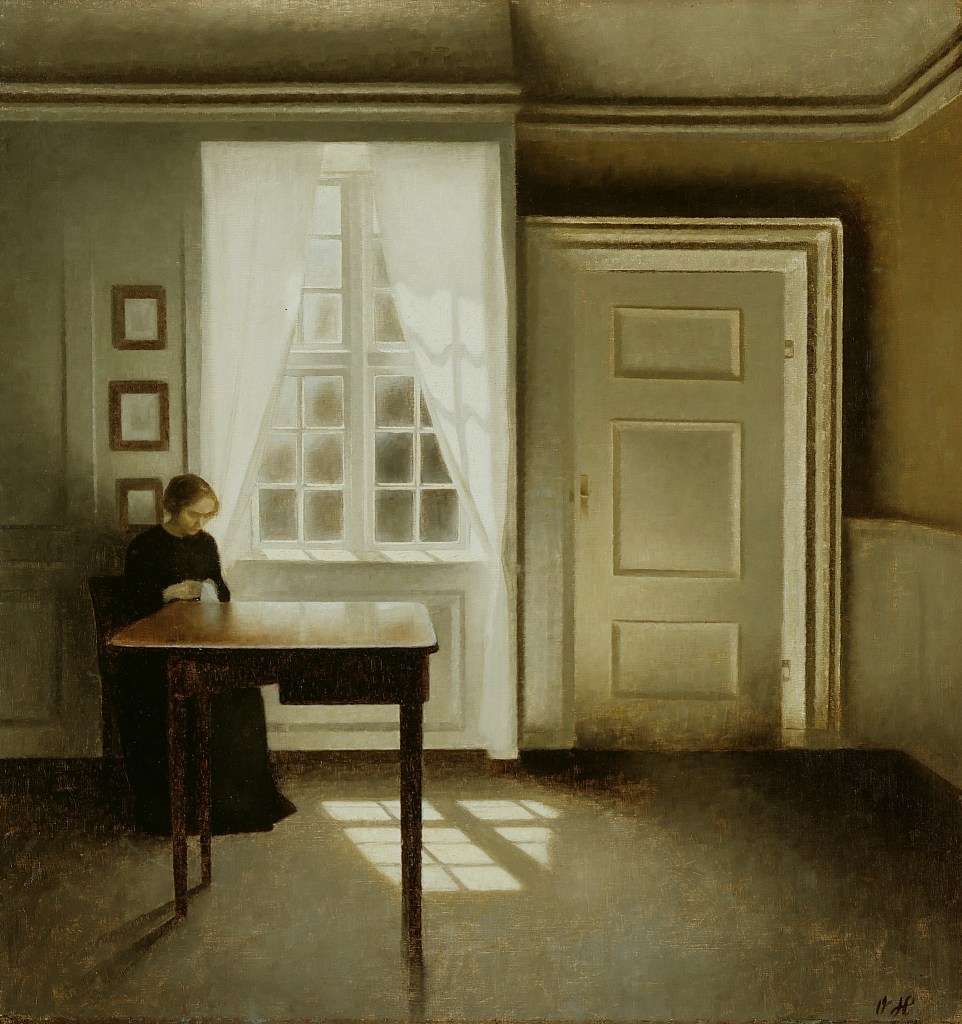
Hanging somewhat nondescript among the other artworks in the Modern section of the DIA, Interior With a Lady (1901) by Vilhelm Hammershøi depicts precisely what the title describes. Alone, in a room empty except for the single table which she sits near, the “Lady” dressed in black looks intently at a cloth that she holds in her hands. Her brow is slightly furrowed, but the meaning of her expression is unclear. Perhaps she is distressed, perhaps she is just thinking. What is clear is her total, complete solitude in that moment. Sunlight hangs hazily, with yellow green-gray and beige in the empty room. Like many of the other works in the Modern section of the museum, there is no description aside from the title and name of the artist.
White Ebony (2021) by Idowu Oluwaseun is quite different from Interior With a Lady. It hangs in a special exhibition wing featuring art by black artists, the canvas taking up nearly a full wall, as opposed to the rather quaint size of Interior With a Lady. White Ebony depicts two people in an intimate embrace, one with dark skin behind the main subject, who has lighter skin, covering her eyes. The main subject’s hands are lightly touching the fingers which stretch across her face. Both figures contrast against the dull grayish blue (or blueish gray?) background. Unlike the solitary “Lady,” they are very much together in this moment.
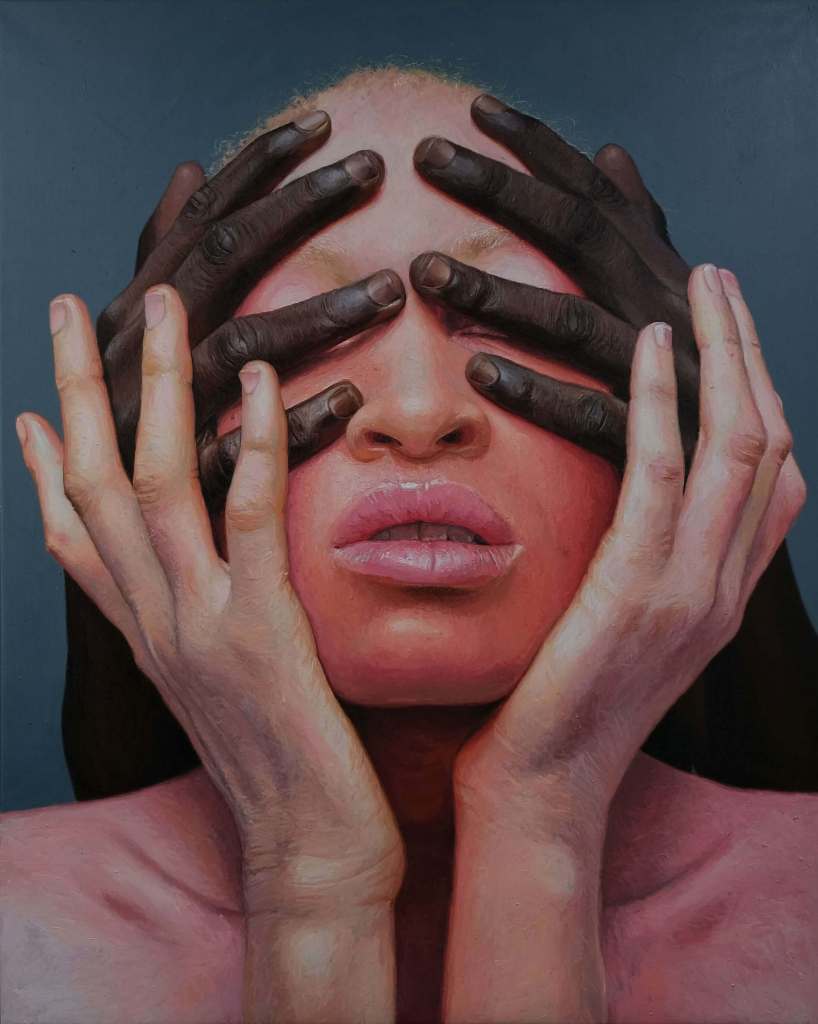
These works, from their size to their subject matter to their use of color, are quite different. The difference I find most interesting, however, is the fact of White Ebony’s accompanying description. The DIA’s description of White Ebony discusses the artist’s intention to “investigate colorism” through his depiction of black people in various intimate poses. What I find interesting about this description is the fact that it does not afford a reading of the painting which does not focus on its exploration of said intimacy. If it is a painting about intimacy, it is only allowed to be so insofar as the intimacy is about colorism.
Interior With a Lady, on the other hand, with no description, can be whatever it wants to be. One can investigate the “Lady’s” expression and imagine that she is wearing black as a sign of mourning, or one can think about the color and use of shadow lingering in the corners. One could also imagine gender politics playing a role in the “Lady’s” portrayal, or they could choose not to. The painting is about all of these things, I think, among many others—solitude, reflection, late-afternoon sun. But what is important is that the viewer can see it as all of these things. The viewer is not prompted to imagine it as a work of “sociology” (though, of course, in some respects it must be).
As I looked at the works in the Modern section, many of them are listed without descriptions, and those that have descriptions reference something unique or “different” about the form of the painting. None of them ask the viewer to think about any social dynamic in particular. Of course, much of the art could have been about their surrounding social dynamics, but the descriptions, or lack thereof, invited the viewer to focus on their aesthetics.
White Ebony, however, because of the description, becomes a painting entirely about the politics of colorism and a statement against it. Yes, of course, it is about colorism, in the sense that racial politics—in a world where racism is very real—are brought to bear on the painting itself and because the artist had that in mind when they chose to paint it. But the point is that, with these descriptions, the DIA invites a reading which is only about these things.
This recalls for me a question which Toni Morrison lifts up when discussing Romare Bearden’s work: “can a human artist not be responsive to human things, which are, by their nature, social things?” (180). While the works of modernists, left to speak for themselves on the wall, are allowed to be thought of as “self-evident,” works like White Ebony are “called upon” to speak for social issues.
Yes, of course, art speaks on social issues. But the contrast, for me, lies in the unspoken divide between art which is about these things, and art which can merely be art. And of course, neither is wholly either! No single painting, even of a single square, or a white canvas painted black, remains outside of the social dimensions which inform the life of the artist who paints it or the one who looks at it after the paint has dried.
But neither is any of them not also about the way light reflects off skin, the expression of a face, the movement of an arm or the curling of hands around each other or the shadows collecting in the corner of the room or in the creasing of skin.
Morrison writes of Bearden’s work, “there is information, truth, power, and beauty in his choice of color, form, in the structural and structured placement of images, in fragments built up from flat surfaces, in the rhythm implicit in repetition, and in the medium itself” (180). It is in this information, the information of aesthetic choice and movement, among the other things which inform art (but not only these), that works of art stand as important and worthwhile. It is with the color and the statement, the exploration of both social life, and form, where art comes alive.
For me, it seems there ought to be a balancing of scales. Art by black people, about black people, need not be prodded like an anemone in an aquarium touch pond to attend to politics, racism, color, or life. It will about these things, or about any number of other things, not just these ones, because it is art. Of course, it also contains “certain human elements” (Morrison 179). Without them, it could never be art.
WHITNEY / ALBERS
By MYKA DAVIS
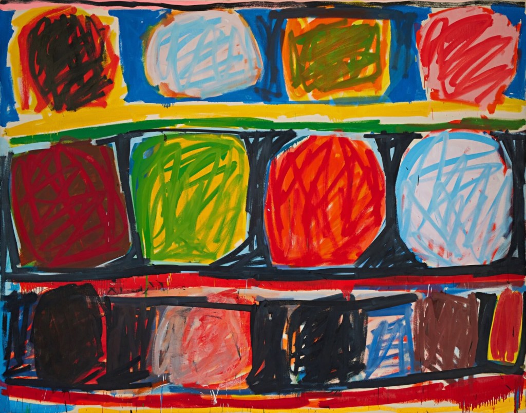
Featured in the Contemporary section with the focus on “Asserting Black Humanity” at the Detroit Institute of Arts (DIA), Radical Openness (1992) by Stanley Whitney (according to the artwork’s description) depicts the numerous variations that arise from working “with and within the grid.” With the use of complementary colors, there are irregular shapes that resemble circles and squares. In Whitney’s work, there is the use of flatness with “random” scribbles in each of the shapes and across the painting.
I put “random” in scare quotes, as there always lies a meaning for an action in art, even if the artist does not intend it. The name Radical Openness, the subject of the piece and the section of the DIA it is in, in my opinion, goes beyond the simplicity of being within a painted grid. I believe that within the idea of the grid, Black people are expected to be constrained within one (or within the lines) and act in accordance to what being within the line means. Here, Whitney is exploring what could be done with and within the “grid,” and based upon the chaotic scribbles, I understand this to be an attempt at trying to break out of the confines of the grid—with no success.

Within the Modern section of the DIA, Homage to the Square: Shade around Shade (1962) by Josef Albers depicts the use of perception based upon color. Albers believed it was interesting how the perception of color could become changed based on the color next to it. He believed that perception could fulfill the understanding of a painting. Similarly to Whitney’s work, there is emphasis on the shapes and colors, though Albers utilizes muted colors such as white, light grey and dark grey.
My main takeaway from the comparison is the ability for one artist (Albers) to construct a work of art based upon a non-personalized approach with no social cues to influence him. That encompasses the image of modernism, whereas another artist (Whitney) cannot escape the social/political stance of his being, which is inevitably intertwined with his work.
If I were to separate the artist from their artwork, the two paintings could appear to be created by the same person, though once the artist is introduced, it changes our experience of the work.
I believe these statements can also describe the understanding surrounding the labels “African American” and “Modern.” When modern work is created by a Black person, the work takes on a skew where rather than being looked at for the subject in comparison to other types of art, the artist’s being becomes inescapably involved.
Even in my instance of comparing the two artworks, I couldn’t help but take into account the various social meanings that could be present in Whitney’s grid, meanings that don’t immediately come to mind in works made by white artists. This comparison bears on my understanding of the term “Black Modernism” by noting the importance of the roots of the person behind the work rather than just the work itself.
For Romare Bearden, this makes good sense, given that Stanley Whitney is (in Bearden’s phrasing) a Negro artist. As Bearden states in “The Negro Artist and Modern Art”: “If it is the race question, the social struggle, or whatever else that needs expression, it is to that the artist must surrender himself. An intense, eager devotion to present-day life, to study it, to help relieve it, this is the calling of the Negro artist” (90).
While I understand Bearden’s point in what constitutes being a Negro artist, is the role of the Negro artist to be socially limited to the Black struggle? Yes, there are social aspects that do play into art done by white artists, and their artwork can be/is looked at from varying subjective lenses, but they have the ability to separate their being from the artwork.
Even in instances when there is an explicit personal intertwining between the white artist and the artwork, the intertwine can usually be looked at as a secondary factor.
MOORE / LIPCHITZ

By RONAN MANSILLA
Featured in the Contemporary section of the Detroit Institute of Arts (DIA), The Council (2021) by Mario Moore depicts black visual artists Jamea Richmond-Edwards, Mario Moore, Titus Kaphar, and Mark Thomas Gibson seated around a table that is draped in an African-patterned cloth (Detroit Institute of Arts, “Council”). Richmond-Edwards and Gibson are seated on ergonomic office chairs, and Kaphar sits on a red cushion atop a stack of concrete blocks. The composition of the painting is closely based on The Governors of the Kloveniersdoelen (1655) by Bartholomeus van der Helst (Detroit Institute of Arts, “Council”).
The room the artists are in (in The Council) is relatively large, and in the background, outside the room, a dog stands in the doorway to the outdoors, where a single tree is growing. Scattered around the scene are various publications—books on Basquiat, black art, and Civil War art, as well as a copy of The New York Times dated “February 21, 2021.” Moore’s rendering of the scene is realistic, with great care paid to lighting, shadow, and proportion. The wrinkles in the artists’ clothes are intricately detailed, as are the pages of the newspaper and the books strewn about the room.
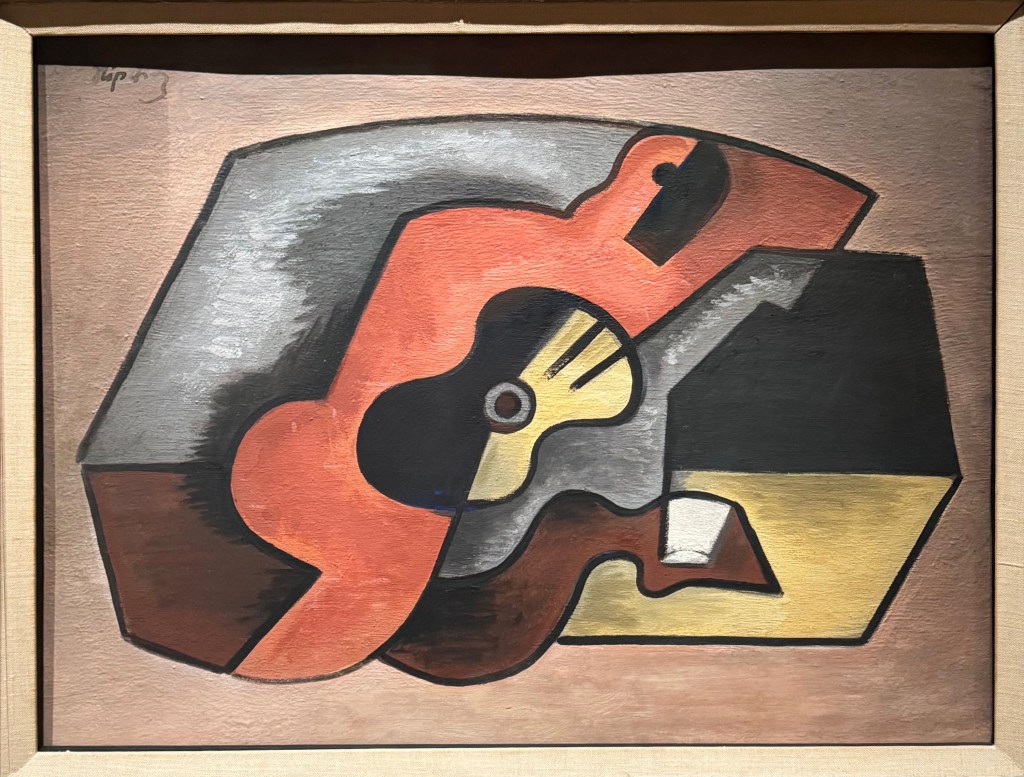
Hanging in the Modern Art section of the DIA, Study for Woman with Guitar (c. 1925) by Jacques Lipchitz depicts the abstracted form of a woman on an angular, asymmetrical couch cradling a guitar that lacks a visible neck. The woman is entirely red, except for her featureless face and ear, which are black. The couch appears to be black, yellow, grey, and brown—or else black and yellow with a gray and brown blanket draped over it. The woman’s left arm is resting on the back of the couch.
There is some dimension to the painting, simple shadows and highlights, but it is a decidedly flat painting, with large blocks of single colors and thick, uniform lines.
“Modernism” is a category of art; “African American” is both a category of art and a demographic of artists. This distinction allows for some particularly compelling intersections, as a work can be both African American and modernist in equal measure, with no need for compromise. Additionally, because of the experimental nature of modernist art and the expressive distortion Romare Bearden recognizes in African art, there is a lot of room within these categories/intersections for works that play with conventions (88).
While it may not be apparent at first, both The Council and Study follow Clement Greenberg’s idea of “Modernism us[ing] art to call attention to art” (6). Study does so more obviously. Per Greenberg’s sense of modernism, the flatness of Lipchitz’s painting draws the viewer’s attention towards the painting as a painting. It is perhaps not as blatantly modernist as the flat paintings of, say, Kasimir Malevich, since Study does reference “figurative” subjects (a woman and a guitar, rather than just paint and canvas), but it is definitely a strong example of modernism (Greenberg 6). Even if the viewer sees the musician in the painting, they will also notice the painting’s flatness, its abstractions, its unreality. Words like “photorealism” or “depth” will not come to mind when the viewer speaks of it later.
The Council, on the other hand, is decidedly not flat. While it may seem at first that Moore, like a traditional realist painter, is “using art to conceal art” (Greenberg 6)—and that his homage to van der Helst’s painting constitutes the unoriginality of “borrowed forms” (Bearden 88)—Moore is genuinely “taking advantage of the Negro scene” (Bearden 88) to speak about the history and perception of black art. It is art calling attention to art, and in some ways, it does so even more effectively than Study’s flatness.
In Moore’s take on The Governors, the dapper, influential white politicians have been replaced with black artists (one of whom is himself), implying by comparison that the black arts scene is both stately and politically important. The contemporary artists are surrounded by books about black art from various time periods and a newspaper from the immediate present, creating a figurative timeline of African American art in a single tableau. It is art about art that calls attention to this fact not through flatness—the awareness of the medium upon the canvas—but by the meta-ness of a modern black artist painting modern black artists surrounded by histories of black art, drawn in the “illusionist” style of conventionally white art (Greenberg 6).
It meets expectations of form (it looks like a realistic painting), then breaks them with the expectations of another form (it is self-referential, like a modernist painting), then breaks those expectations once more (its allusions serve to “call up associations,” taking the viewer out of the painting) (Greenberg 6).
Modernist painting is often flat, and flatness brings awareness to the work’s physical medium. Repeatedly broken expectations are another form of flatness—once you realize that your first, second, third impression was incorrect, you are so far out of the world of the painting (no matter how realistically rendered) that you cannot help but acknowledge the painting as painting, art supplies slathered on art supplies in such a configuration that this portrait of realistic people around a realistic table can no longer “conceal” its paintedness.
Study is a modernist painting.
The Council is an African American painting and a modern painting.
With The Council, Moore shows that it doesn’t have to be just one or the other.
KAPHAR / PICASSO

By GRACE PATRICK
Displayed in the “Asserting Black Humanity” section of the Detroit Institute of Arts (DIA), I Knew (2023) by Titus Kaphar depicts two Black men working on an old red car. The hood is open, with one man’s left hand resting on top of the hood, keeping it open. The other man, standing to the right, points to something within the car. The man on the left wears a shiny blue hat, the setting sun reflecting off of it. He also wears a collared blue shirt, brown pants, and brown shiny leather shoes. The back of his head is detailed, with the nape of his neck painted to show where the skull meets the neck, highlighting his ears. The man on the right wears a casual green shirt, charcoal dress pants, and shiny brown shoes. In contrast, the detail given to the man on the left is not afforded to the man on the right. His face and hands are depicted as mere shadows, while his ombre blonde hair sits atop his blank side profile.
A sunset sets the sky ablaze in pink and yellow hues behind a blue, three-story house. It is a friendly looking house, with trees behind it. On one tree, a pair of perfectly good shoes swing from a branch. On the porch steps of the house sits a young Black boy watching the car inspection scene intently. The most detailed portion of the painting is the boy’s face, which is etched into the viewer’s memory. He looks as though he is staring not only at the scene unfolding before him but also at the viewer. Each coil of his black hair is highlighted, and the light sits upon his face, emphasizing every feature on his face, neck, and arms. He wears a yellow T-shirt, the blue house casting a blue glow on the top of it. He wears jeans and black socks, as well as mismatched sneakers—one red and one black-and-white.
This painting is rich in depth, with cuts and crevices created by light. The depth adds to the emotion of the painting, rendering it mesmerizing as the viewer can focus on sections to see the detail or what the artist intended to emphasize.

Featured in the “Modern” section of the DIA, Girl Reading (1938) by Pablo Picasso depicts a girl engrossed in a book, resting her head on her manicured hand. With one hand holding the book in place and brown eyes scanning the text, she sits with an expressionless face and rosy cheeks. Her raven hair matches the seemingly iron chair she sits on, while her purple and blue patterned blouse catches the viewer’s eye. The top of the chair, showing mainly the two lateral beams and one horizontal beam holding the chair together, rests on the girl’s shoulders in an odd way, almost as if the chair itself is weighing her down. The book rests on a wooden table, contrasting with the industrial-looking chair she sits on. This scene takes place in a plain, undecorated white room with the corner as the main feature.
The painting is quite flat in nature. The girl’s face lacks true dimension and shape, showing both sides of the face at one point of view. This creates a sense of truth, with no hidden intentions or secrets, just an unveiling of the form. Beyond the face, the flatness creates an air of simplicity, allowing the viewer to connect with the girl in her true form and perhaps even in their own.
Assessing these two paintings, the power of the face and its impact on the viewer is revealed. There is a common saying that states “the eyes are the window to the soul,” which might be true. However, as these two paintings suggest, the face is the soul and spirit, the individual in their full form. Their expressions, where they have been and where they may go, live within their faces. The face ultimately tells a story.
The “Asserting Black Humanity” section of the DIA and the “Modern” section could be seen as opposites. The former showcases growth, prospering yet rooted in the past, in a culture that refuses to forget how it got to the present. The “Modern” section, however, takes the present, the actual growth, and seemingly distorts it to show the root. To show the soul of the object in which the modernist is trying to project, it is stripped down to its bare bones, to simple lines and structures. The “Black Humanity” section builds upon the root or the foundation to construct growth, while the “Modern” breaks down growth to reveal the root.
However, both paintings focus on the face or profile, knowing the power in emotion and the almost primal connection that draws us to one another’s face. In “Rectangular Structure in My Montage Paintings,” Romare Bearden states: “One can draw many social analogies from the great works of Bruegel—as I have no doubt one can draw from mine—my intention, however, is to reveal through pictorial complexities the richness of a life I know” (132). Relating to this quotation, the comparison of the two paintings at the DIA reveals how the face, as an expression of the spirit and soul, can be multifaceted and represent both identity and culture. The “Modern” section deconstructs growth to reveal foundational truths, while the “African American” section focuses on that growth rooted in the past.
In both cases, the face, bathed in light and emotion, becomes a powerful tool, reflecting the artist’s intention to show the essence of life, whether through the preservation of cultural memory or the deconstruction of modern existence. Both of these approaches seek to convey the soul’s essence, much as Bearden wanted to present the richness of life through his own art.
Comparing I Knew and Girl Reading, the labels “Black” and “Modern” turn out to be not as distinct and clear-cut as they may at first appear. The “Black Humanity” section emphasizes the importance of cultural roots as well as the growth that emerges from them, while the “Modern” section seeks to strip away growth, revealing the foundational essence. Both paintings, however, use the face as the central symbol of emotional truth.
This comparison challenges our understanding of “Black Modernism” by showing that Black art, like modernism, seeks to deconstruct and reveal foundational truths, whether by preserving cultural memory or reimagining modern existence.
Ultimately, in this comparison, the face (and its true expression) emerges as a powerful symbol in both traditions, presenting the soul and spirit’s essence through different yet similar approaches, drawing humanity together in a universal need for connection.
WILEY / CRISS

By ASHA GEORGE
Untitled (Copley) (2022) by Kehinde Wiley is featured in the “Uplifting Black Humanity” section of the DIA. It’s an homage painting to Watson and the Shark (1786) by John Singleton Copley. Both paintings feature a group of people on a boat during a storm, defending themselves with a spear against a shark. The most noticeable difference between the two is, in the original, the focal points are white and in Johnson’s rendition, they are black. However, the different color grading of the two paintings should also be of note. In Copley’s, the entire piece is rather dim, but in Wiley’s, he has his subjects in bright-colored shirts almost dressed in the colors of a nice sunset.
Waterfront (c. 1940) by J. Francis Criss is in the Modern section of the DIA. It illustrates a factory scene near a waterfront overwhelmed by flatness. The painting features a plain sky and produces an overall dull feel, making every object harmonious with the next.
The main difference I noticed between the two wings, as well as the pieces is the difference in what the focal point is. In some of the modern pieces I saw, the subject is not a person but a structure or an object. In “The Negro Artist and the Modern Art,” Romare Bearden captures this modernist focus on structures rather than people when he writes that “modern art . . . is really nothing new . . . Fundamentally the artist is influenced by the age in which he lives. Then for the artist to express an age that is characterized by machinery skyscrapers, radios, and the generally quickened cadences of modern life, it follows naturally that he will break from many of the outmoded academic practices of the past” (Bearden 85).
Alternatively, in almost every piece in the African American exhibit, the subject is a person. I saw this as a privilege that modern artists could depict anything to be seen and have the story understood. It is as if the paintings in the “Black Humanity” wing had to depict people, a piece that can look a viewer in the eyes to be seen and understood. It’s the reason I was so drawn to Johnson’s piece, as to me the color choice of the sailors forced my eyes away from the landscape—which other paintings usually call attention to.
This makes me think Black art has come such a long way from how it Bearden describes it in “The Negro Artist and the Modern Art.” He writes in 1934 of “the timidity of the Negro artist of today.” He continues: “His work is at best hackneyed and uninspired, and only mere rehashings from the work of any artist that might have influenced him. They have looked at nothing with their own eyes—seemingly content to use borrowed forms” (Bearden 90).
Timid and uninspired the black artist is no longer. Even Johnson’s piece, while directly inspired by another, still manages to paint a different story. Arguably, there are many pieces like Criss’s telling the same tale.
WILEY / PICASSO

By GIULIA VITALE
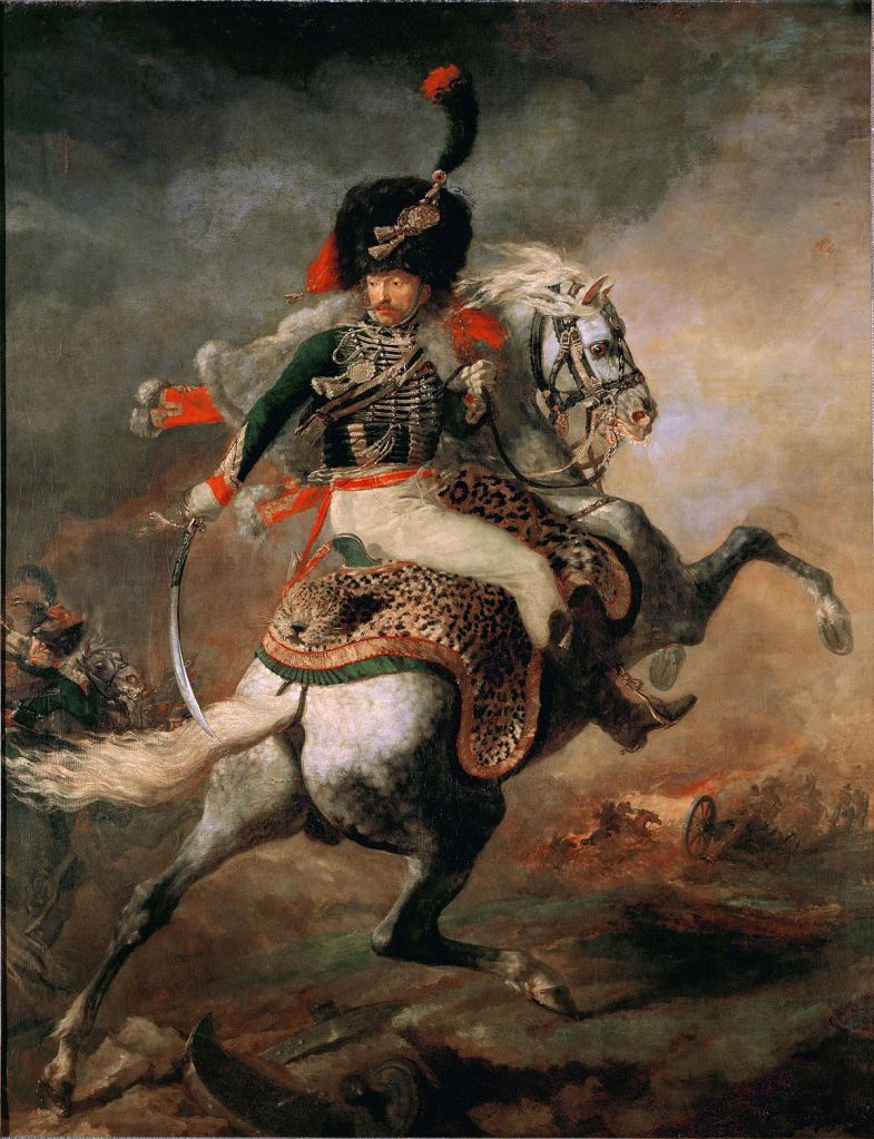
In the Contemporary section on the South Wing of floor 2 of the Detroit Institute of Arts (DIA), there is a large painting titled Officer of the Hussars (2007) by Kehinde Wiley. It is a really baroque looking piece, with a burgundy background, a regal gold frame, and gold leaves in swirling patterns. In the middle, there is a black man with a sword riding a horse. Despite the piece’s baroqueness, the background has a desert/western plateau type land formation, which is an interesting blend between the vibes of the Renaissance and the American West. The little plaque next to it explains that it is indeed inspired by a European piece of a military hero on horseback, and its attempt was to represent black men in Western art history, as it is rare to see.
Wiley’s work is a reimagining of Théodore Gericault’s The Charging Chasseur (c. 1812). Wiley’s piece has a lot of color and dimension as the black man is in the front of the picture and the horse’s head is noticeably more distant from the perspective of the onlooker. It is also a very realistic painting in terms of human features and clothing.
In the modern art section of the DIA, Pablo Picasso’s Seated Woman (1960) shows an abstract depiction of a woman in a chair. I noticed a trend among the modern art pieces, in that they typically depict a familiar concept (like a human) in strange shapes or colors that are not “normal” in relation to how something looks in reality.

Picasso’s painting divides the woman up into shapes and has two different colors in the background, creating a divide through the painting, one in which the colors sort of mirror each other and contrast. It is also arguable that you might have to look a little harder at this painting to deduce that it is a woman and she is sitting in a chair and probably holding some kind of paper. The painting also seems like it is not fully rendered, or like there are areas that are void of color or look like they were scribbled in. It is definitely abstract and almost cartoonish in comparison to a painting that is trying to communicate realisticness.
However, the more one looks at the painting, the more one sees and the more nuanced/sophisticated the art becomes. For example, the woman’s face appeared to me at first to be front facing, but then I realized there are two halves that construct her face, one being a light side profile and the other being a dark forward facing profile.
Though these pieces are both oil on canvas, they have communicated very different subject matters and markers of their genre. I would say that in comparing the “African American” and “Modern” sections of the museum, there can be some overlap. In general, the African American pieces largely depict themes of African American life, and Modern pieces have a certain style that makes them almost surreal.
There can definitely be overlap between the two categories, but I think that the “Modern” works are most often trying to stray from the themes of the Renaissance or that which has been done before, while the “African American” art sometimes tries to reimagine ideas of the past with a new spin, or insert black culture into places where it has been underrepresented, like in Officer of the Hussars (2007).
Picasso’s piece, though dubbed Modern, is older than Wiley’s piece (in keeping with the conventional periodization of “modernism” in roughly the first half of the twentieth century). So, I think that African American and Modern art forms are not mutually exclusive.
Black Modernism, then, is inserting black culture and life into surreal-ish paintings that focus on the use of colors and shapes to signify a deeper meaning or extra layer of dimension to an otherwise flat canvas. As I think about the meaning of Black Modernism, I think of this moment from Eliot’s “Tradition and the Individual Talent” (1919): “Yet if the only form of tradition, of handing down, consisted in following the ways of the immediate generation before us in a blind or timid adherence to its successes, ‘tradition’ should positively be discouraged” (Eliot 38).
This is not to say to destroy or dismantle the idea and tradition of Modern art, but instead take what previous generations have done for modern art and include representations of all people and subject matters, namely black Americans. The form of the art stays similar (the colors, shapes, and the surreal aspects) but now there is also a deeper societal impact being included within the nuance of a “Modern” art piece.
SPANN / HENRI
By ALLENA WILLIAMS
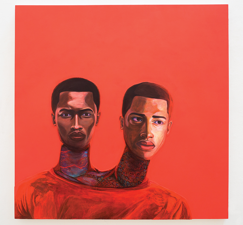
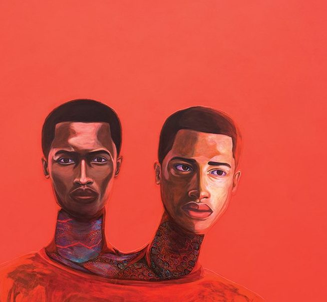
Featured in the “Asserting Black Humanity” section of the Detroit Institute of Arts (DIA), I grew an extra head to watch over my brother (The Middle of Nowhere) (2018) by Vaughn Spann depicts an individual with two heads. One person is staring directly at the viewer, the other to the side, and there are interesting details on their necks, which resemble blood vessels. The background, their shirt and veins are all shades of red.
Hanging in the Modern section of the DIA, The Beach Hat (194) by Robert Cozad Henri depicts a woman who, staring at the viewer, wears a beige beach hat with a blue ribbon, a white blouse and red sweater. The painting has a gold frame around it.
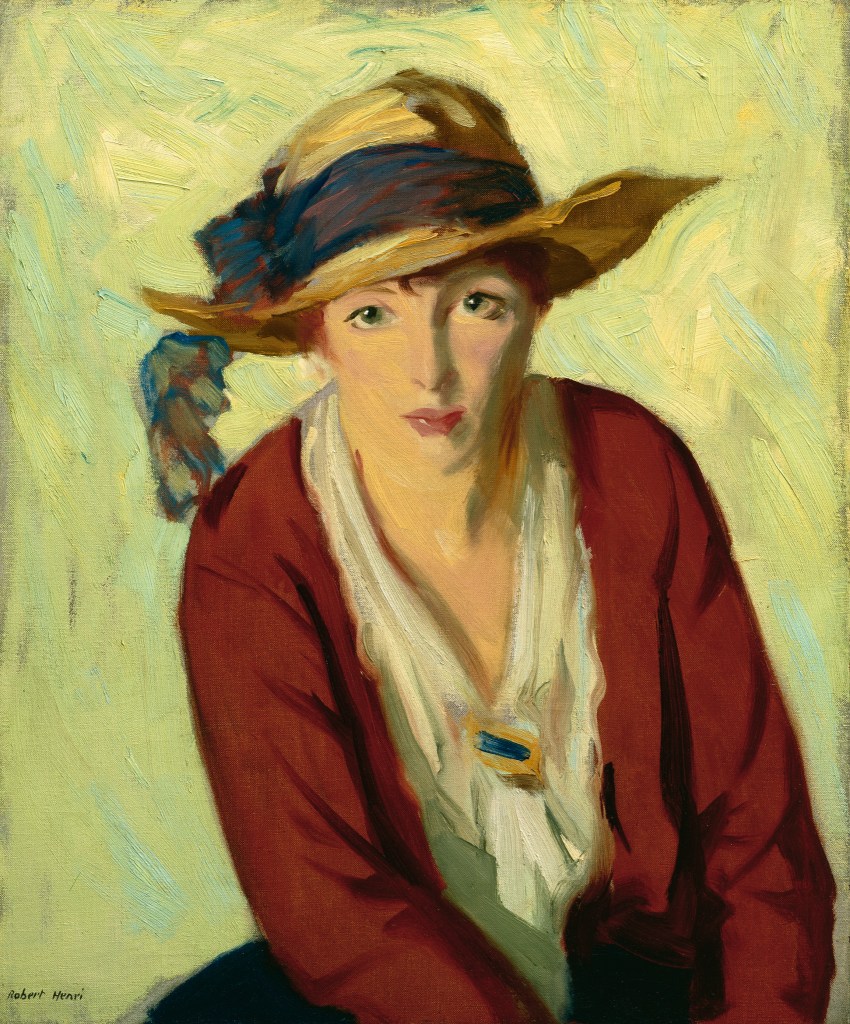
My main comparison is that, despite their obvious differences in subject matter and style, there is no qualitative difference between the two works. If they were placed in the same exhibit, one would not necessarily have more of an impact than the other. The side-by-side comparison of the labels “Modern” and “Black” highlights the issues of the Black canon, specifically, what is expected of Black artists. Black artists are expected to write about race and racism and only that, nothing else. To make matters worse, we live in a system that allows and encourages this act. Black artists can produce work not directly related to race and racism, but this expectation forces them into a liminal space.
Race and racism shape a person’s identity so they should be allowed to make art about it—and Black people should be allowed to produce work not related to it. More importantly, we should accept it just as we would if a white person created it.
This comparison has had an impact on my understanding of the term “Black Modernism.” I now believe an appropriate definition of “Black Modernism” is “art made by a contemporary artist (loosely defined) who happens to be Black.” I do not place emphasis on the artist being Black but rather focus on the art itself. I learned by comparing these two works of art the impact of labels.
In some sense, The Beach Hat might be viewed as “better” since it inhabits the Modern section, but the other piece, I grew an extra head to watch over my brother (The Middle of Nowhere) is just as skillful and important.
Two additional notes I would like to mention are that the museum’s labels of “Modern” and “Black” are irrelevant, used to divide and put the art into strictly defined boxes and that the difference in framing is a smaller form of exclusion. These ideas relate to the reading “The Negro Artist and Modern Art” by Romare Bearden. Two quotations stick out to me. The first is: “They say that since the Negro is becoming so amalgamated with the white race and has accepted the white man’s civilization he must progress along those lines” (2). The second is: “Modern art has borrowed heavily from Negro sculpture. This form of African art had been done hundreds of years ago by primitive people” (1).
If this is true—that modern art has borrowed so much from Black people—why are the sections separate? Is it the fact this society cannot and will not acknowledge the contributions, whether forced or not, that Black people have made for this country? These categories reveal that systemic racism and segregation goes beyond typical barriers and into a world that is abstract and subjective, a fact that reveals the preposterousness of segregation.
Moreover, Black people are living in a façade-like world, made to believe that white civilization is the only way to live. This relates to my point of Black people being forced to create within a liminal space. If this reality is true, one where Black people are living in an illusion and where the influence of Black creation is not acknowledged, this would dismantle the framework of this space as this space cannot exist under these conditions.
If we were to address these arbitrary divisions, there might be slight change in the way we appreciate and acknowledge Black artists and their work. I fear, however, that the overall social structures would continue.
MODIGLIANI / KAPHAR
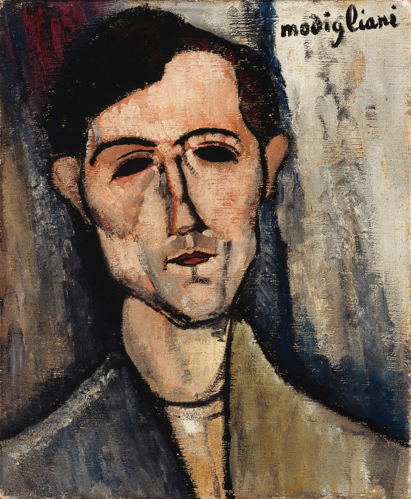
By HANNAH BURDINIE
Featured in the Modern section of the Detroit Institute of Arts (DIA), A Man (1918) by Amedeo Modigliani depicts a male figure with elongated facial features. The color palette is muted, while the background is sparse, focusing attention on the subject. His gaze is conveyed through almond-shaped, black eyes devoid of pupils or discernible detail. Interestingly, the text accompanying the artwork claims Modigliani was influenced by African art.
In contrast, Titus Kaphar’s I Knew (2023), situated within the “Asserting Black Humanity” section of the DIA, offers a very different visual experience. The painting is filled with bright and vivid colors, depicting an everyday scene of two men working on a car parked in front of a modest house—except for one man on the far right of the canvas. He, unlike the other subjects in the painting, is devoid of detail, lacking all facial characteristics. This shadowy depiction sets him apart from the rest of the scene.
Though these paintings are from different time periods and artistic traditions, both Modigliani and Kaphar use abstraction—particularly in faces—to evoke emotion and meaning. Modigliani’s elongated style, inspired by African art, makes the figure feel distant and detached. Kaphar, on the other hand, uses abstraction—popular in modernism—to explore personal experiences. By leaving one figure faceless, he forces the viewer to think about representation and what it means to be seen or forgotten. By comparing their works, we can see how African and modernist influences intersect. Modigliani borrows from African aesthetics to reshape portraiture, while Kaphar blends modernist techniques with his own style to reflect on life.
Kaphar fits well within Black Modernism—he is a Black artist using modernist styles to examine his own memories and identity. One could view Kaphar’s work as a commentary on race, but just as easily as a mediation on life, memory, love, family—anything human. Kaphar’s art is fundamentally about exploring and understanding his own experiences, and while race plays a role in that, it’s only one aspect.
As Toni Morrison asks when analyzing Romare Bearden’s commentary on race and art, “How…can a human artist not be responsive to human things, which are, by their nature, social things?” (Morrison 180). Kaphar’s work, like Bearden’s, responds to both personal and collective histories, but it is not confined to a singular narrative about race.
MASSEY / ALBERS
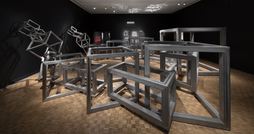
By ISABELLA GOOLSBY
The first and perhaps biggest piece of artwork in the 7 Mile + Livernois exhibit currently installed at the Detroit Institute of Art (DIA), Whatupdoe (2024) by Tiff Massey depicts large stainless-steel frames linking together as one giant connection. The description of the sculpture reads, “The work celebrates adornment’s power in forging identity and community ties . . . it is an invitation to recognize and embrace our interconnectedness. The conjoined links represent connections across generations and among diverse neighborhoods and communities.”
Hanging in the Modern section of the DIA, Homage to the Square: Shade around Shade (1962) by Josef Albers depicts a small dark grey square, bordered by a bigger, lighter grey square, which is surrounded by a pale-yellow background. The description of the painting states, “Josef Albers has made color and our perception of it the subject of this painting. He was intrigued by how one color can appear quite different depending on the color next to it.”
I think the most glaring theme I see when putting these two art pieces side by side is their respective ideas on color identity and being grouped together. Massey’s artwork seeks to signify unity by taking away the identity of color and letting communities interconnect without it being a huge focus. Albers seeks to highlight the contrast of the appearances of color and how different they really are when put next to each other. Both also use grey squares to play with the concept of depth in their art. Albers demonstrates depth on a flat surface, essentially depending on the viewer to perceive the depth of the subject by themselves (this would of course fit Clement Greenberg’s definition of modernist painting, which emphasizes “flatness”). Massey does not give the audience the option to do this, and instead makes her sculpture big and dimensional, taking up as much of the exhibition room as it can.
Essentially, what I took from this is that modernism often seeks to stand out on its own, and African American art often seeks to interconnect with community.
Together, “Black Modernism” seeks to establish its identity as standalone, while also seeking community and connections. In “The Negro Artist and Modern Art,” Roman Bearden writes that “The artist must be the medium through which humanity expresses itself. In this sense the greatest artists have faced the realities of life, and have been profoundly social,” (90). A white male artist in the 1960s will of course have a different sense of “modern” life compared to a female Black artist in the 2020s. Regardless, both artists use their medium as a means of showing, even challenging, the realities as they themselves see it.
What you choose to utilize that glimpse of reality for, as a means of standing out or coming together, is where the terms African American, Modernism, and/or Black Modernism come in.
WILEY / JOHNSON

By EMMANUEL KUAC
Kehinde Wiley’s Untitled (Copley) (2022) shows a group of strong black women trying to save someone from being eaten by a shark. Wiley based this painting off an older one from 1786 called Watson and the Shark by John Singleton Copley. In that painting there is a group of White men and one Black man trying to save another white guy from the shark. Wiley replaced them all with Black women. He kept the same setup but changed who the people were. The colors in the background really pop, which gives the painting a lot of energy. This painting shows Black women as brave and powerful. Wiley changing the characters in the painting shows how black women aren’t just victims and side characters and how they deserve to be seen.
In the Modern section of the DIA, Raymond Johnson’s January/February (1966) collage is a different kind of artwork. Johnson glued and painted a bunch of little pieces of board to make it look like a city or buildings. It doesn’t show people or a story like Wiley’s painting but it’s still modern in its own way. The modernist style is more about breaking the rules and trying new ideas. Instead of telling a story or showing something obvious Johnson tries to build a feeling with texture and shapes instead of people’s words so we can use our own minds to create an image for ourselves
What I got from comparing these two is that black modernism isn’t just set to one visual style or method; it’s about innovation and reclamation. Wiley’s painting confronts the historical exclusion of Black figures from traditional European painting by placing them boldly at the center while transforming the narrative to center Black females in a moment of heroism, control, and action.
This recalls Romate Bearden’s statement in his 1934 essay “The Negro Artis and Modern Art”: “It is time for the Negro artist to stop making excuses for his work. If he must exhibit, let it be in exhibitions of the caliber of ‘The Carnegie Exposition.’ Here among the best artists of the world his work will stand or fall according to its merits.”
Bearden is saying that Black artists need to stop relying on other people’s standards and just let their work speak for itself. Wiley does this by putting Black figures in a place where they’ve never been before, showing their strength and importance in a way that hasn’t been done in European art. In a sense, Raymond Johnson’s January/February collage also fits well with this description because it’s all about trying new things. His work shows that modern art doesn’t have to follow the old rules. He uses a bunch of materials, shapes, and ideas in ways that push the boundaries of what art can be.
BRANCUSI / OLUWASEUN

By CHARLIE LIPKA
Featured in the modernist section of the Detroit Institute of Arts, Sleeping Child (1906–1908) by Constantin Brancusi quite literally depicts the face of a child, set to lay on its side, mimicking how a child would rest their head on a pillow.
Featured in the Special Exhibitions South section of the Detroit Institute of Arts, White Ebony (2021) by Idowu Oluwaseun is a painting consisting of two black subjects. At the center of the painting is a light-skinned black subject who is resting their head on the bottoms on their palms, fingers traveling to the same level as their eyes. The second black subject only appears as their fingers cover the light-skinned subject’s face, particularly their eyes.
Through comparing these two works, we see that there is a distinct desire to depict a sort of quietness in their artworks—in the Sleeping Child, through a vulnerable subject, especially because they are sleeping, and in White Ebony, through a light-skinned subject’s eyes being gently covered by a darker-skinned subject’s hands.
These two pieces of art reminded me of the last section of “The Negro Artist and Modern Art” by Romare Bearden: “The artist must surrender himself. An intense, eager devotion to present-day life, to study it, to help relieve it, this is the calling of the Negro artist” (90). As I said before, both of these artworks depict some type of quietness, or as Bearden puts it, surrender. These pieces reminded me of the concept of not participating in the game, the idea of rejecting the white world and embracing a black world from within, epecially as White Ebony is providing commentary on how colorism is harming black communities.
These two pieces encourage a prioritization of the internal instead of the external.
Black modernism, I feel, is a pursuit of restructuring and creating an interior that refuses to participate and find relief from a world that has never suited Black life. In both pieces, the subjects have their eyes closed, no longer perceiving the world and instead retreating into a world of dreams and possibility.
AFFOTEY / GIACOMETTI

By LIV PETERSON
Featured in the “Asserting Black Humanity” section of the Detroit Institute of Arts (DIA), Amoako and the Glass Vase (2020) by Francis Annan Affotey is a work of oil and acrylic on canvas. In the center is a black man with his arms crossed, wearing a bright coloured shirt with leaves on it. His eyes are red, and his hair is pulled back and tied up in a bun. In the top right, there are yellow flowers in a glass vase. The painting is a mix of mainly light blues and greens.
Hanging in the “Modern” section of the DIA is Man Crossing a Square on a Sunny Morning (1950) by Alberto Giacometti. This is painted bronze and is placed on a wood slab. It is a sculpture of a very skinny man walking on a stone slab. His feet are oddly long, the only colours are grey and brown/bronze.
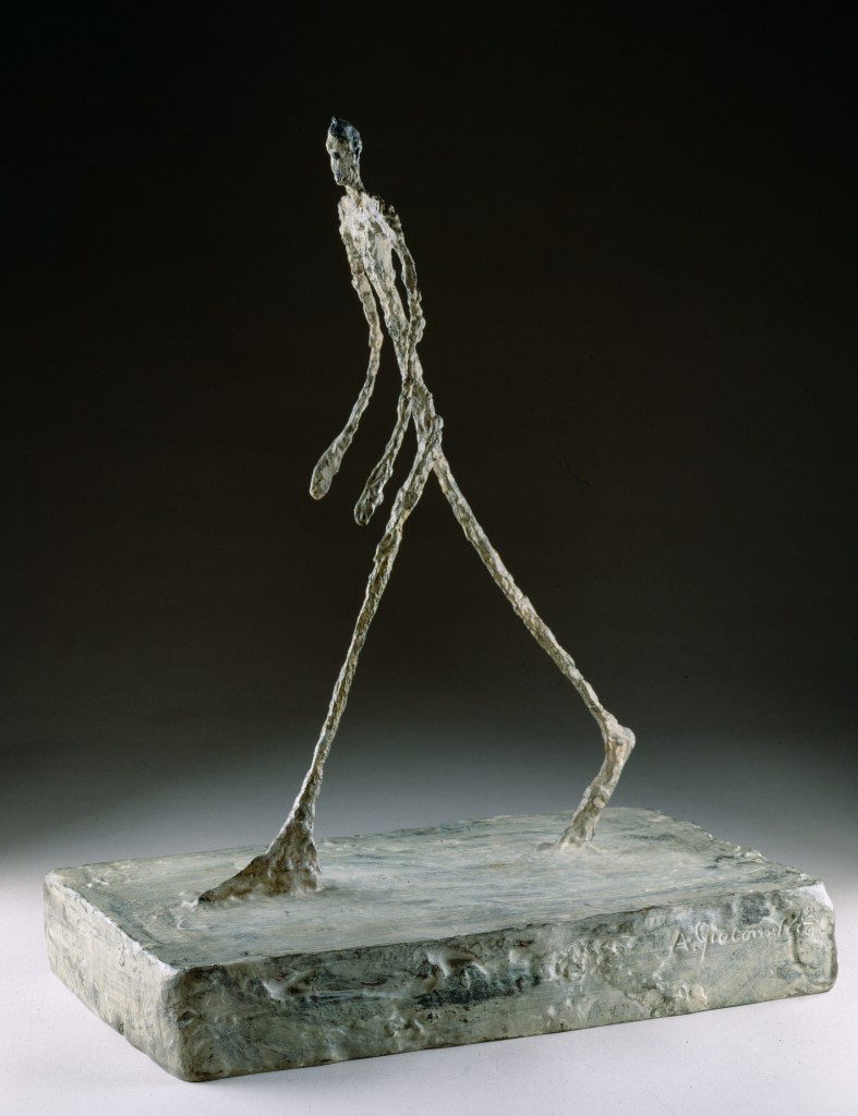
I chose these two works of art because, right away, they were the first pieces in their respective exhibits that I was drawn to. They are unique.
What I learned from this side-by-side comparison of the labels “Black” and “Modern” was that “Black” art is framed in terms of people and experiences, whereas “Modern” art is imagined to be about art, and experimenting with art. When thinking about “Black Modernism” I understand that it is a combination of the two: it is about representing Black lives with a unique or experimental portrayal, showing Black lives through a modern lens.
Both pieces feature a man as the main stage but each portrayed in their own unique ways. This comparison recalls Clement Greenberg’s description of modernism across various art forms: “What had to be exhibited and made explicit was that which was unique and irreducible not only in art in general but also in each particular art” (Greenberg 1). I thought this quotation was extremely fitting because it discusses how art is unique in its own ways and how one thing can be demonstrated totally differently in different artworks, just like the two pieces I chose. Though Amoako and the Glass Vase is much brighter than Man Crossing a Square on a Sunny Morning, and both are very different types of art, both still represent a man or a vision, but through a different medium.
CRISS / OLUWASEUN
By MARC NADDAF
Located in the Modern art section of the Detroit Institute of Arts (DIA), Waterfront (c. 1940) by J. Francis Criss is a painting depicting a simplified view of industrial buildings, towers, and smokestacks. The painting makes use of simple color planes, bright tints, and distinct shapes. Rather than using shading or multidimensional perspective, it highlights the painted surface’s simplicity and flatness.
According to Clement Greenberg, Modernist art aims “to eliminate from the effects of each art any and every effect that might conceivably be borrowed from or by the medium of any other art” (Greenberg 6). The method used in this painting is consistent with his point of view. In other words, the painting is not trying to imitate reality. Instead, it draws attention directly to the act of painting and its constraints. The work reflects a period when industrial expansion represented optimism and American progress. However, despite its industrial subject matter, it transmits a sense of tranquility and nostalgia (at least to me).
Displayed in the “Asserting Black Humanity” section of the Contemporary gallery of the DIA, White Ebony (2021) by Idowu Oluwaseun portrays an albino woman whose face is gently touched by two darker-skinned hands. The painting realistically captures detailed textures of skin, hair, and hands. This piece raises awareness of colorism by showing how internalized discrimination affects unity in the Black community. Oluwaseun explains in the work’s description, “The Black community has to come together as one . . . and we should stay united.”
This work in particular efficiently tackles a societal issue with historical roots. A related claim is made by Romare Bearden, who argued in 1934 that African American artists frequently produced “poor echoes of the work of white artists, and nothing of himself” (Bearden 89). This resemblance is clearly rejected in Oluwaseun’s work. In fact, he creates a statement about acceptance, community, and identity that is both personal and culturally based.
Comparing these two works offers insight into the ways “Modern” and “Black” art categories overlap and interact. Criss’s Waterfront exemplifies Greenberg’s idea of Modernism by emphasizing the “ineluctable flatness” of painting and rejecting realistic illusion (Greenberg 6). White Ebony uses contemporary visual clarity to convey its message, while projecting quite modern themes and is strongly tied to racial identity.
Bearden emphasizes the importance of authenticity in art, stating, “the artist with vision, sees his material, chooses, changes, and by integrating what he has learned with his own experiences, finally molds something distinctly personal” (Bearden 88). By accurately expressing historical information in his paintings, Oluwaseun embodies this idea presented by Bearden.
This comparison clarified my understanding of the term “Black Modernism.” It involves not just embracing Modernist methods but also using them for beneficial use in order to communicate experiences that are closely related to Black identity. I learned from both pieces that Modernism can be successfully applied to produce art that promotes reflection about society and interpersonal relationships within that world.
SPANN / MOORE
By MELISSA CONVERSE
*Melissa went off script, comparing two works in the “Asserting Black Humanity” exhibit at the DIA in relation to insights by W.E.B. Du Bois and Claudia Rankine
There is a painting I have admired for some time now by Vaughn Spann entitled I grew an extra head to watch over my brother (The Middle of Nowhere) (2018). Found in the Contemporary section of the Detroit Institute of Arts (DIA), Spann’s polymer paint and paper on wood strikingly depicts what it would look like if we could see what W. E. B. Du Bois termed “double consciousness”—where one is acutely aware of the perceptions and possible dangers of what those perceptions are of those around us. I believe it also depicts how it feels to be aware of one’s duplicity—a two-headed version of the self.
Also in the DIA’s Contemporary section is the oil on canvas The Council (2021) by Mario Moore. This painting reinvents the Dutch painting The Governors of the Kloveniersdoelen (1655) by reimagining the statesmen as “everyday people” in casual conversation—notably, modern day black people in place of the Dutch elite. This painting is a political and social justice statement, a powerful one of ownership and normalization of black culture.
For me, both paintings relate to Claudia Rankine’s Citizen, where the questions either stated or implied are of identity and perception: “What did you say?” and “Exactly what did you mean?” which when applied to both the Spann and Moore works, takes on a political, perhaps instigating tone (Rankine 43, 47).
Spann, in his depiction of being aware of the double-person in a world not always accepting of him, and Moore, with his political stance on black community as itself a kind of elite, both pose questions for the onlooker that they answer for themselves: What exactly am I thinking or saying?
To me, great art always poses more questions than answers. And pieces such as Spann’s, Moore’s, and Rankine’s are no exception.
WORKS CITED
Bearden, Romare. “Rectangular Structure in My Montage Paintings.” 1969. The Romare Bearden Reader, edited by Robert G. O’Meally, Duke University Press, 2019, pp. 121–132.
Bearden, Romare. “The Negro Artist and Modern Art.” 1934. The Romare Bearden Reader, edited by Robert G. O’Meally, Duke University Press, 2019, pp. 87–90.
Du Bois, W. E. B. The Souls of Black Folk. 1903. Edited by Henry Louis Gates, Jr. Oxford University Press, 2007.
Eliot, T.S. “Tradition and the Individual Talent.” 1919. Selected Prose of T.S. Eliot, edited by Frank Kermode, Farrar, Straus and Giroux, 1977, pp. 37-44.
Greenberg, Clement. “Modernist Painting.” 1965. Modern Art and Modernism: A Critical Anthology, edited by Francis Frascina and Charles Harrison, Westview, 1982, pp. 5–10.
Morrison, Toni. “Abrupt Stops and Unexpected Liquidity.” 2004. The Romare Bearden Reader, edited by Robert G. O’Meally, Duke University Press, 2019, pp. 178-184.
Rankine, Claudia. Citizen. Penguin Random House, 2015.

From left to right, back row: Marc Naddaf, Hannah Burdinie, Giulia Vitale, Lauryn McDougal, Myka Davis, Charlie Lipka, Brianna Brown-Cushenberry, Joshua Otten, Emmanuel Kuac / front row: Grace Patrick, Isabella Goolsby, Stephen Pasqualina, Asha George, Liv Peterson, Hannah Cunningham. / not pictured: Ronan Mansilla, Melissa Converse, and Allena Williams, who bolted for lunch too soon.

Leave a comment