“Every image embodies a way of seeing.”
– John Berger
In April 2026, students in Professor Stephen Pasqualina’s Writing About Literature and Literary Theory courses visited the Detroit Institute of Arts. Their task: spend 10 minutes with a single work of art. What follows are their selections and reflections.
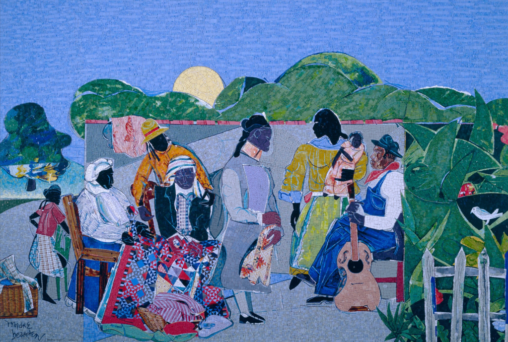
Quilting Time (1986) by Romare Bearden
Morgen Rhodes
I spent about 15 minutes with Quilting Time (1986) by Romare Bearden at the DIA. According to the plaque, it is a mosaic of tesserae mounted on plywood, and it reflects Bearden’s childhood memories of quilting bees in the rural South, where women gathered to sew while children played nearby. I first noticed it because of the mosaic itself. I love stained glass, and I am always drawn to art that takes broken pieces and makes something whole out of them. That was what pulled me in before I even stopped to read the label. (Another example of art that I LOVE that uses this concept is The Heidelberg Project in Detroit.) The room itself was fairly quiet, with only a few works hung, and this one sat a little off to the side, with the other two artworks on the wall across from this piece. I saw it way early on and liked it, but I kept walking through the museum, and then ended up circling back towards the end of our free time because I couldn’t stop thinking about it.
At first, I looked mostly at the people. My eyes went straight to the figures, their clothes, and the quilt spread across the center. The colors caught me immediately: green, blue, yellow, red, orange, black, white, purple, gray. There is so much pattern packed into the scene, and I find that very impressive. The quilt especially interested me, with all of its tiny plaid, striped, and geometric pieces. Then I started noticing that the whole artwork works the same way as the quilt inside it. Everything is built out of fragments—ones even smaller than I had originally realized. Even Bearden’s signature in the corner is made out of tile.
When I got closer, I started paying attention to details I had seen right away but appreciated more with time. The sun sits low behind the hills, almost like a cut-out circle pressed into the sky. The tree on the far left has bits of yellow, blue, and white inside it, which made it feel like light was slipping through the leaves. Some of the faces are also much more defined than others. The man with the guitar especially stood out to me because his features felt more deliberate and textured, while some of the other faces are darker, flatter, or marked with blue lines and purple-brown tones. I kept wondering why my eye landed on some figures more than others, and I was curious as to whether or not the piece was intentionally created to have this effect.
The longer I stood there, the more I thought about labor. I was already impressed by the scene itself, but once I let myself really look at the mosaic up close (as in, literally inches from my face . . . ), I started thinking about the time it must have taken to place each piece. It made me want to know the full story of how it was made, how heavy it is, how it was installed, how long someone had to stand with all these tiny pieces before this became a full image. That is part of what makes me love this piece so much. It felt warm and communal from far away, but up close it also felt painstaking.
What I enjoyed most about this assignment is that my experience kept changing depending on how I looked. From farther back, I saw a gathering. Up close, I saw thousands of separate decisions. I left thinking about how a scene can feel so full of ease while also carrying so much work inside it, and I kept wanting to know what else was still hidden in the surface that I had not stood there long enough to catch. Even now, I feel inspired by not just the pure beauty of the piece, but by the attention to detail and hard work that went into its creation, too.
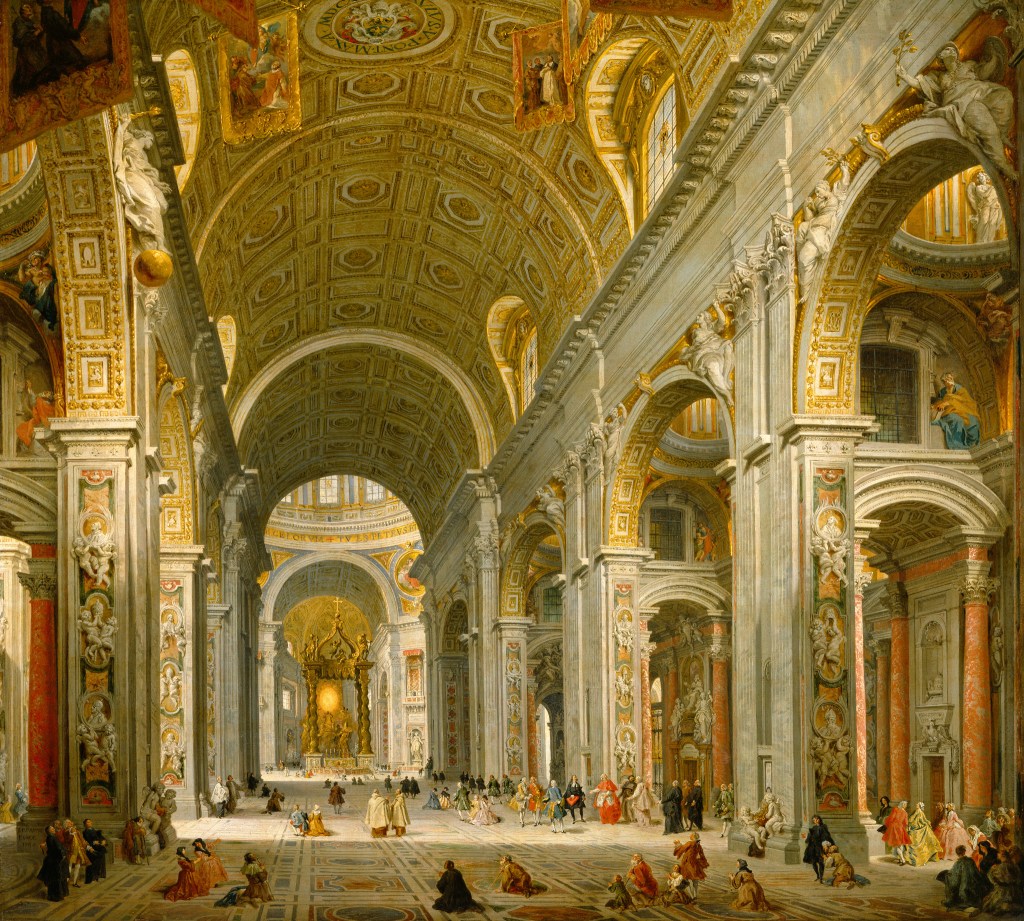
Interior of St. Peter’s, Rome (1750) by Giovanni Paolo Panini
Lilyan Choucair
At first, I noticed the scale of the painting. The ceilings stretch so high they almost feel unreal, and the arches keep pulling your eyes into the space. It made me feel small in a strange way, like I was standing inside something much bigger than myself. I started noticing smaller details I completely missed at first. What stood out most were the people. They’re tiny compared to the building but they’re doing very normal things like walking, talking, sitting, and gathering in small groups. I noticed that even in a space that feels grand and almost intimidating, life is still happening in quiet and ordinary ways.
It reminded me of how John Berger talks about how meaning isn’t fixed. We bring our own perspective to what we’re looking at. I originally saw the structure but then I started seeing people just existing within it.
I also noticed how the light works in the painting. It doesn’t hit everything equally but it gently highlights certain areas. We can see how the light hits the center of the floor and parts of the architecture. It almost guides where your eyes go. That made the space feel calmer with all its detail. It’s not overwhelming once you settle into it and it actually feels peaceful.
Spending more time with it made me start asking questions instead of looking for one clear meaning. Who is this space really for? The building feels formal but the people seem relaxed. Do they feel like they belong there or are they just passing through? It also made me think about some of our other readings on space and visibility and how environments aren’t neutral but can quietly shape who feels comfortable, who belongs, and who might feel out of place.
By the end of the ten minutes I wasn’t trying to “figure out” the painting anymore. It felt more like an experience than something to solve. The longer I looked, the more it shifted from something grand to something human and familiar. It made me think about how the way we look at something can completely change what we see and how even the most overwhelming spaces are still filled with small moments.
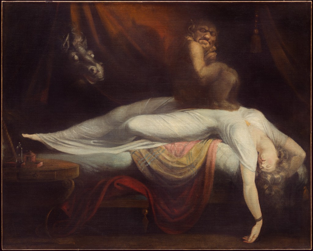
The Nightmare (1781) by Henry Fuseli
Candy Saputo
Originally, I was going to choose another image of a small child that I thought looked like me in sixth grade; however, after an experience I had with a staff member at the DIA, this painting intrigued me more.
At first glance, I thought this was an average painting depicting a dead woman with an odd demon sitting on her. The woman is dressed in white, symbolizing purity and innocence, thus depicting that her death was something that occurred outside of her hands.
Whilst examining this painting, a woman who works in the DIA saw me and stated that this was her favorite painting. She pointed out the horns hidden in the shadow of the demon, how the donkey is technically called a “mare” (hence the name “nightmare” in the painting), and the three scratch marks on the blanket. She raised a good point: the reason that she could notice new things about the painting was because she could see it in person.
Comparing this to John Berger’s Ways of Seeing, he raises the point that with technology, paintings can be seen more and more frequently and there is less scarcity. This leaves me with the question if I would have noticed the horns or the scratches on the blanket if I viewed it on a screen rather than in person.
Looking at the screen right now, I cannot even see the scratches, so did I answer the question myself? Would I have even come across this painting if I never went in person and talked to the worker at the DIA? What other paintings or sculptures have I missed out on since I am hidden behind a screen for more than eight hours a day?

Happy World – Scattered Crumbs (2011–2014) by Ik-Joong Kang
Lena Williams
I noticed how each piece is like its own little world. It reminds of me of a deconstructed mosaic or puzzle. Everything is separate yet created with the intention of functioning as one. The title mimics this, specifically “scattered crumbs,” meaning it was once a whole piece of bread (or something in relation) that has been deconstructed and recomposed into a re-creation.
I left thinking about was how each scattered piece is part of a larger picture and how this determines the way the viewer views it. If the pieces were in different places, it could create different meanings, but the work also it gives the viewer freedom to recreate and connect pieces together for themselves—like a puzzle with a multitude of possibilities that simultaneously work within a structure or system.
I felt as if I was both the artist creating the piece, trying to figure out how I want it to be interpreted, and the viewer who tries to figure out what the artist wants me to interpret. I wanted to stare at each tiny tile, like each was its own world, and fully analyze each while also wanting to look at each title in relation to its whole. This piece moves me, as it reminds me of a shattered vase, once an illusion of perfection—its original meaning will never be regained but rather created into something new through the hands of its viewer. This invoked curiosity.
The piece left me questioning how I can recreate this experience in a poem, as after writing / reading / performing poetry, I notice how everything can be created into a poem if you allow it to be.
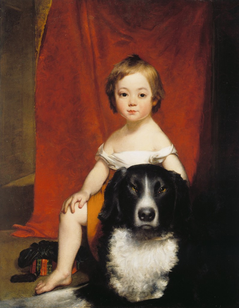
Frank S. Harding (1843–1846) by Chester Harding
Mel Converse
My soul-pup was a border collie named Turbo (fastest dog I’ve ever known). And so I was instantly drawn to this oil painting and the likeness of Turbo. While dogs are often in the background of paintings, grounding them into the life and times of the setting, this painting’s dog is front and center; occupying more room and garnering more attention than the human subject. At least, at first.
The artist nailed the intensity of the dog’s eyes—the way the dog is staring makes me feel a bit unsettled. He looks unhappy. Which makes me a bit unhappy. I want to pet him, tell him he’s a good boy, cheer him up a bit. He’s is sitting between the knees of his boy, who I initially thought was a girl because of the clothing . . . it’s a dress, right? And an off-shoulder dress, too. But the title says it is the artist’s son. So now I’m confused. The child’s face, like a lot of cherub-faced children, is somewhat gender-less, but the hair cut/style would be more in line with a “boy” of that period. Why am I so stuck on this? Why do I need to know if the child is a boy, a girl, a boy dress as a girl, or . . . ?
Now I feel like the annoyed look of the dog’s stare. And the tassel and cord (?) behind the child . . . seems odd. This entire painting is now feeling like a grouping of elements in a “practice”-type painting. After all, even the backdrop (red) curtain isn’t completely obscuring the walls behind. And the shadow crossing into the subjects on the right doesn’t seem like something an artist would allow unless they were practicing how to paint shadow.
More and more, this painting is telling me it was a relaxed setting . . . a “paint me and Duke, dad” moment (I’ve just named the dog and would place money on Duke being the real name. Just look at him!). Which brings me a little joy.
Painters. They’re just like us.
I really love this painting for the care and attention to detail that the painter gave to his son and his son’s best friend—even the curtain behind has a faint monochromatic pattern to it and gold fringe. There is love in this painting. And realness. With all of the other formal and stuffy paintings normally seen in this era—this one pushes back on that.
And I’m left asking, who really was Chester Harding? I bet he took a break after this and played with both his son and the dog. At least I hope he did. And I think *that* says more about the painting that anything . . . that I’m left hoping for love and joy and family harmony when looking at it.
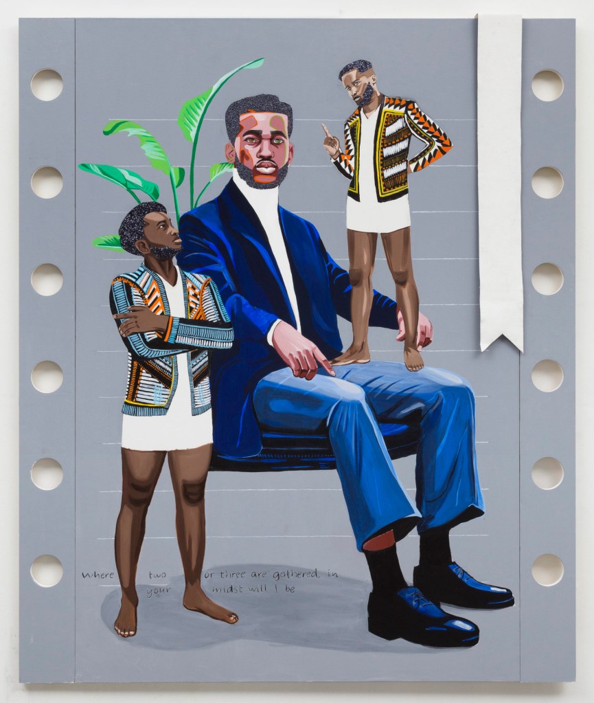
The Gathering (2020) by Conrad Egyir
Jenna A.
When I encountered this piece at the DIA, I was immediately struck. It was unlike anything I had seen before, even after walking throughout the entire DIA. I initially walked past this piece, but backtracked to take a deeper look at it. Upon an immediate glance, I noticed that it is much more modern compared to the pieces I had previously analyzed, and I wasn’t sure that I was quite fond of that until later. I don’t often find myself caring for, or engaged with, modern pieces of art.
Funny enough, even upon reading the man’s name and origin country of Ghana, I felt as though I could resonate with this piece. Seeing how poised he looks, sitting in his blue suit and facing forward, with two (what I deem) reminders or remnants of his culture constantly lingering. It reminds me of the concept of shoulder angels, with each angel trying to pull the person in different directions. Even the positions of each culturally dressed figure struck me. One is grounded, almost admiring the man in the blue suit. Meanwhile, the second figure is positioned standing on the lap of the man, seemingly scolding him. My mind immediately went to a cultural identity conflict—hence why I naturally navigated towards this piece.
I wanted to analyze everything about this when I first came across it. Why are the figures pantsless? Why is there greenery behind the man in the suit? Why is he positioned so that he seems to be ignoring the figures? What is the significance of the quotation on the bottom left? Why is this painted on what looks to be a notebook?
I am still left with all of these questions, and even tried to look for more information online on this artist and his story.
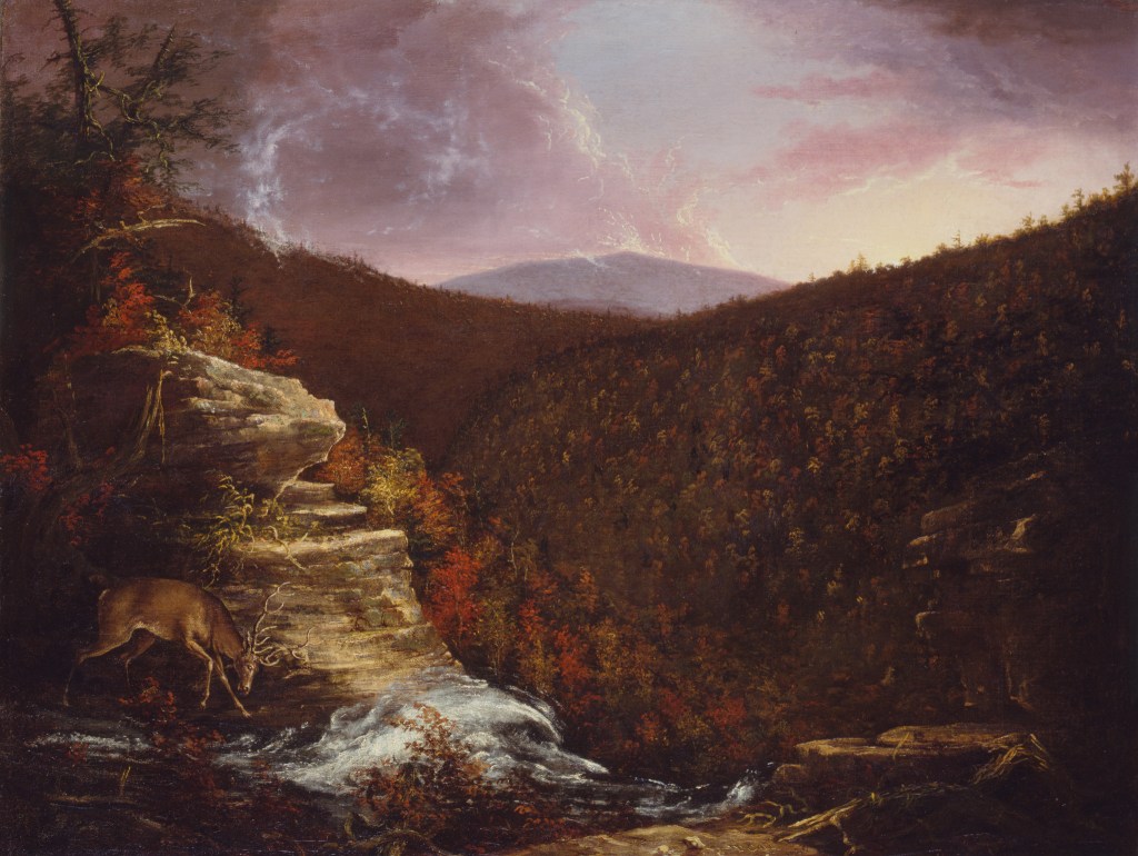
From the Top of Kaaterskill Falls (1826) by Thomas Cole
Asha Sierra
When looking at this painting, I felt an overwhelming sense of calmness, awe, and in some ways, despair. I feel like that difference depends on whether or not I look at the piece as a sunset or a sunrise.
Most of the painting is overwhelmed or consumed by this darkness caused by the shadows of the mountains blocking the rest of the scene from the light of the sun.
When I first looked at the painting, I interpreted it as a sunset, but it saddens me. The light of the day is going out, and this deer is missing it! It’s ignoring the beauty of the world being heightened by the sun. It’s such a beautiful scene, one that I almost want to climb into, and I get this feeling of envy that this deer gets to live in this dream scene, and it’s not appreciating it as I would.
However, the longer I looked at it, I began to think it was a sunrise, and it shifted my whole perspective on the painting. When the painting is at the beginning of the day, the deer’s ignoring the sun is almost beautiful. It shines on them every day, and its beauty is not a part of its daily routine. This is not to say it takes this beauty for granted, as it’s still on a rock, which is practically the one spot in the painting where the sun’s light can reach because the sun is only meant to shine on the one spot that deserves it: the deer.
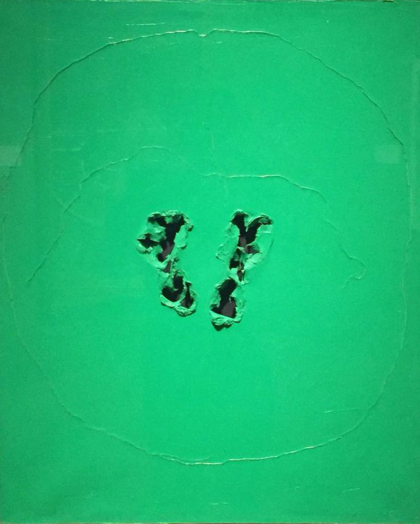
Concetto Spaziale (Spatial Concept) (1963) by Lucio Fontana
Sarah Morar
Ten minutes was a lot to spend with a simple painting, especially since we weren’t supposed to fixate on the meaning of the paintings. I was drawn by the very vibrant green of the painting. The photo didn’t capture the vibrancy of it. It was pretty high in chroma. The paint itself was oil paint and heavy-bodied, applied in smooth strats disrupted by ridges, almost impasto-looking. There is very little brush strokes, though, and it is mostly smooth. The two circles created by the technique Fontana used emanate almost like ripples from two footprint-shaped holes torn from the canvas.
Considering the title, I wonder if the circles represent spheres of occupied space, like personal space. That was my first thought. I also was really curious about the technique he used to achieve such a smooth finish except for the ridges. To me, it looked almost like layers of paint that were peeled. For the footprint holes, it looked like the holes were first cut or stabbed, and the paint was not fully cured. Because it wasn’t fully cured, it could be molded further to take the shape the artist would’ve wanted. That’s my favorite stage of drying paint to work with because it’s still malleable but the outside is cured enough to handle, so it’s squishy but not staining. Except, oil paint takes so long to cure (from 6 months to over a year).
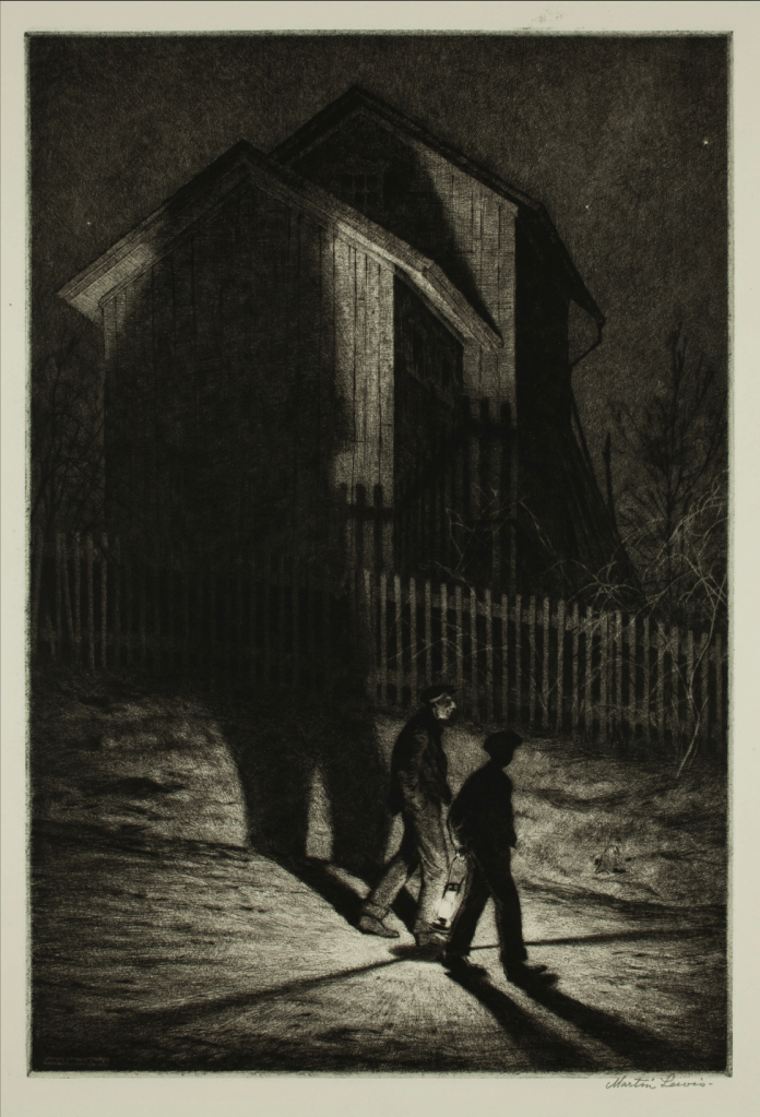
Ha’nted (1932) by Martin Lewis
Ronan Mansilla
Everything is so soft — even the darkest regions. While I tend to expect thick, dark lines to be the harshest parts of a drawing, here the immediate glow of the lantern is the harshest on the eyes. It’s radiance is almost exaggerated, but it works.
I like how the lantern man (LM) looks like the illuminated man’s (IM) shadow, effectively sandwiching IM between shadows. I like the way IM’s shadow is cast so large on the barn, whose planks are so detailedly rendered. I like how the shadow of the fence is also warped, but in a very different way. I like the detail of the fence itself — how the vertical slats aren’t of equal height, how the fence has a post on the right and a damaged spot on the left.
I like how few stars there are — if I were drawing this myself (I wish!), I would have absolutely gone overboard with stars. I like the subtle windows, and the strange detail above the uppermost window that looks almost like a bulging eye. I like the awkward downspout. I like IM’s ambiguous expression, which I read as a slight smile.
I like the strange sense of incorrect perspective on the fence and the closer roof — something about it seems off to me, but that off-ness strikes me as being appropriate. I grudgingly accept the trees and shrubbery, whose wispy branches, unlike every other detail in this drawing, feel somewhat detached from their surroundings, as if floating in space (like a ghost, I suppose). I kind of wish that they were more grounded.
On the side of the further-back part of the house, in the shade, I see what almost looks like a woman’s head and shoulders. If I look away, it takes me a moment to rediscover it. I wonder what the \-shaped slant of the house’s right side is, because that wall should go straight down.
I really enjoy how this is primarily a landscape drawing, yet it is impacted by the humans passing by it. I saw some of Lewis’s other drawings, and I really enjoyed those, too. There is something so soft and atmospheric about this piece, and I think the title is a perfect accompaniment because it sets a mood without being overbearing. I wondered what the haunting was, but that question didn’t distract me from the piece itself — if anything, it gave me a lens through which to approach it, one that fell away over time. This feels like an illustration from an old novel, or perhaps from a children’s scary story collection.
I loved this exercise. Taking my time with this piece, I found myself in a sweet spot of stressless attention — one that allowed me to notice the painting’s details without feeling overly pressured to do so. I felt very present with it. Honestly, I should try to do this every day.
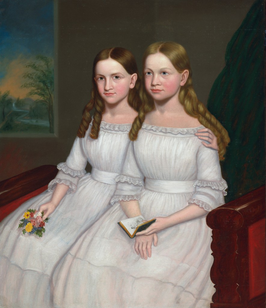
Dennison Sisters (ca. 1845), artist unknown [U.S.]
Maddie Slivensky
I spent a lot of time at the DIA trying to find a piece of art that resonated with me for this assignment. It wasn’t until I was almost through my last exhibit that I found this painting: The Dennison Sisters.
I think this piece really resonated with me because it reminds me of me and my older sister, Molly. As we have gotten older, we have grown apart, but when we were kids we were best friends and inseparable. I saw myself as the sister on the left, and her as the one on the right. Not only do the hair colors play a role in this distinction (she has darker hair than I do), but the objects they are holding are also perfect representations of us. First of all, the matching dresses remind me exactly of matching dresses my mom would put us in for Easter and Christmas (they of course did not look like the ones in the picture though).
Growing up, I was the “nerd.” I loved to read and I loved school. The sister on the left is holding a book, which actually describes me. The sister on the right is holding flowers, which I think perfectly describes Molly. She was definitely the “wild child” and always picked the dandelions in our yard thinking they were flowers.
During this experience, I was a little sad. I was thinking about all those fun memories we had together, and I hope that as we get older we get closer again too! On the bright side, we did just spend a lot of time together last week, so I have high hopes!
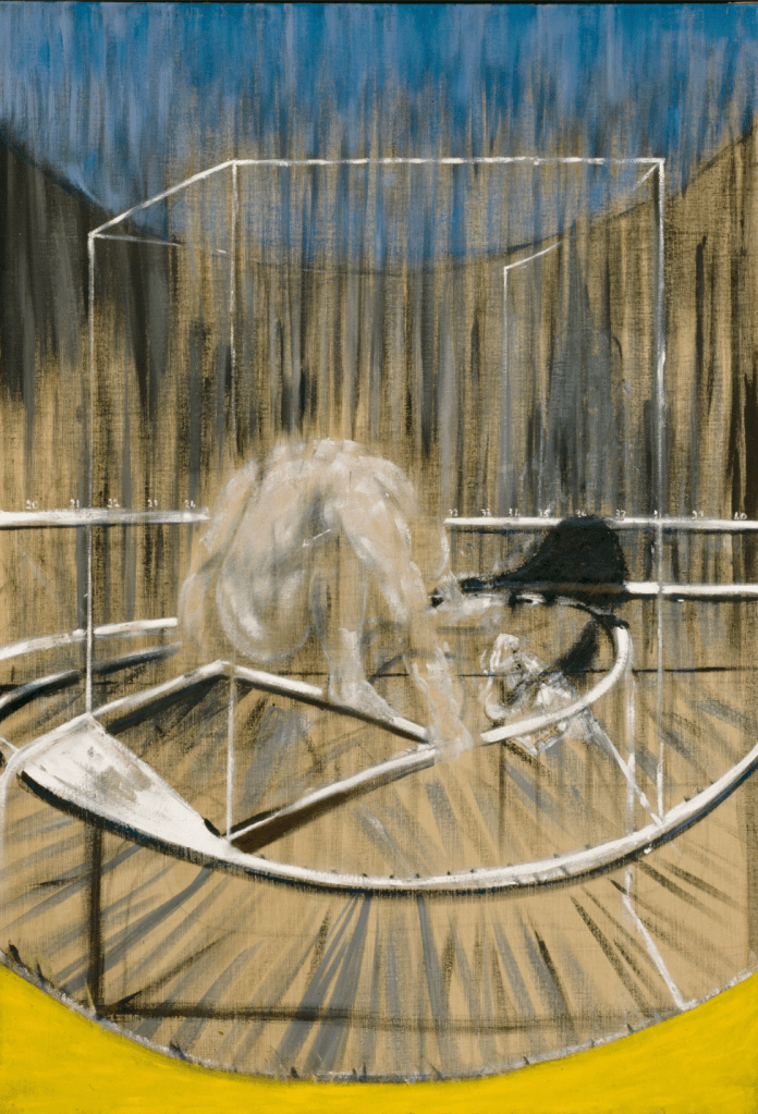
Study for the Crouching Nude (1952) by Francis Bacon
Lauryn McDougal
The thing that immediately caught my eye was how the figure seemed to emerge from the chaos of the background. I can almost imagine the artist’s process, the strokes, shapes, and color seemingly added at random until the end where the form of a leg, an arm, and the body as a whole is suddenly obvious and central to the painting.
I like the colors of the work, especially the bright-white contraption contrasting with the darker background and the crouching figure above it. As I look closer, while I can’t make out exactly what the figure is crouching on, I can see little details added, like the shadow cast a bit far in front of the nude, the numbers spanning across the painting as well, which may hint at what the contraption is, but I really can’t figure it out.
I also wonder whether the artist used a reference. Was it someone in real life that inspired him to paint this, or was he taking inspo from another artist? Why did he do this particular study? Was it to practice with colors and shape, or how to paint the human form in an unconventional pose in 3D space?
I can relate to doing random art studies, but they’re never good enough to be put in a museum!
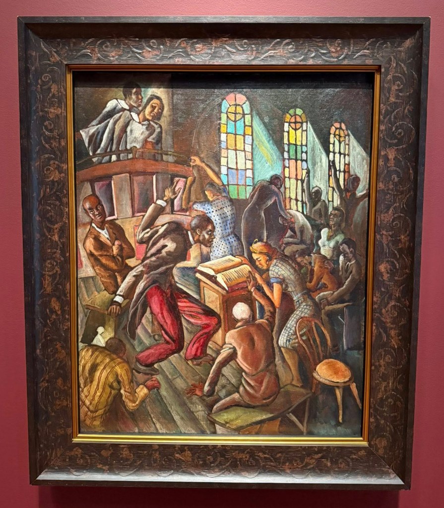
De Good Book Says (Church Scene) (1935) by Wilmer Jennings
Raneem Faraj
At first, I actually thought everyone in the painting looked angry or like something chaotic or even violent was happening. The way the people in the image are reaching, bending, and reacting so strongly made it feel very intense and kind of overwhelming.
The longer I stood and observed, I noticed it was not anger and more like spiritual expression. The movement in the painting really stood out to me. My eyes kept moving around and the painting did not feel still at all. It was like everyone was in the middle of something. I was very focused on the figure in the center because of their movement. I had no idea what was happening until I noticed the stained glass, because usually those are in churches, and it seemed like everyone was singing—which is another thing I know happens in churches.
The stained glass windows also added a calmer feeling compared to the intensity of the people. The more I looked, the more I felt drawn into the scene. It was like I could almost hear the shouting and singing.
The sense of community is what stayed with me the most. It was chaotic, but not disconnected. It had me wondering what it would actually feel like to be there and how faith can bring out strong emotions like that. Even though I am rooted in my faith as a Muslim, I’ve never expressed it through singing.
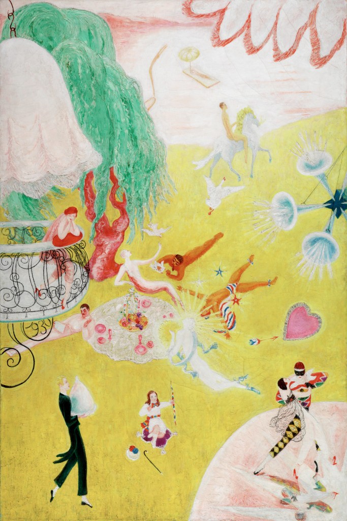
Love Flight of a Pink Candy Heart (1930) by Florine Stettheimer
Grace Patrick
I believe this was part of the modern exhibit, if I remember correctly. It was the first painting that caught my eye, and as I moved through the museum, my thoughts kept circling back to it—until I finally returned.
The first thing I noticed was the use of vivid color—so bright it almost hurt my eyes, so decadent it left me slightly sick after a few minutes. The painting is filled with trapeze artists, butlers, horse riders, dancers—an entire spectacle of performance and excess—that beckons the viewer toward a world free of responsibility, free of ties to the real world. It feels almost childlike, like a picture book I might have read as a child.
It unsettled me, though. Among this conglomerate of figures, all of which were lounging, flying, observing, dancing, riding,, there is no clear sense of place. Where is this? Heaven? Hell? A space suspended between mania and luxury? I honestly have no answer, and the longer I sat with it, the more disoriented I became.
Usually, observation brings clarity; here, it did the exact opposite. The more detail I noticed, the less I understood. I left the painting frustrated by that lack of understanding—though I know one is not supposed to fully “solve” a work of art. Still, I wanted to (the perfectionist in me).
There was also an odd comfort in it, as whatever chaos exists in my own life, the world within this painting remains unchanged—full of trapeze artists and pink candy hearts.
I’m not entirely sure why that comforted me, but it did.
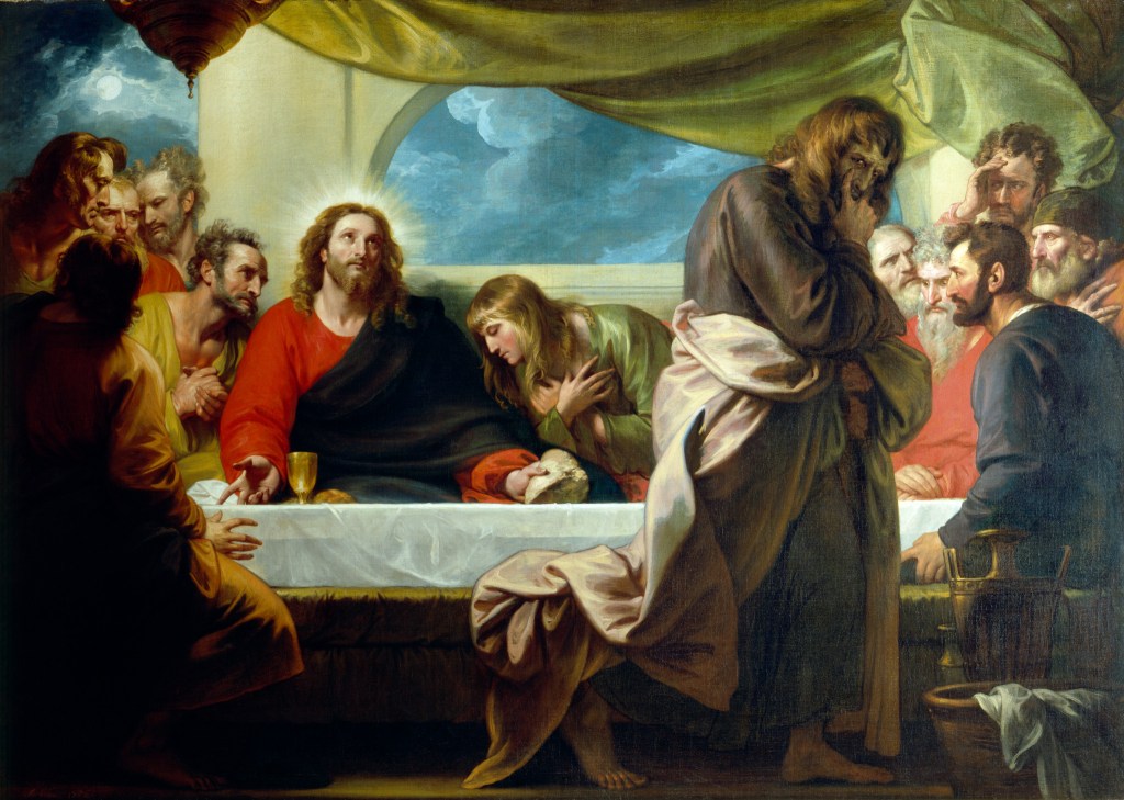
The Last Supper (1786) by Benjamin West
Klara Karkookly
What stood out to me first was how quiet the painting feels, even though there are so many people in it. At a glance, it seems like a crowded, intense moment, but the longer I looked, the more it slowed down. My eyes kept going back to the center, where Jesus is sitting, almost glowing compared to everyone else. That light doesn’t feel dramatic. It feels calm, like everything around him is chaotic but he isn’t.
I started noticing the different reactions of the people around him. Some look confused, some look upset, and others seem deep in thought. It made me feel as if I were watching a moment unfold in real time, not just a frozen image. The figure leaning on the table, almost collapsing into the moment, made it feel more human, and I believe, since he was the only one standing, that figure is Judas, who would later betray Jesus.
What really stayed with me was the contrast between stillness and movement. Jesus feels grounded, while everyone else seems unsettled. I wasn’t thinking about what the painting means as much as how it made me feel.
After standing there for a while, I left wondering how much of what I saw was shaped by where I was standing. It made John Berger’s ideas feel real—this painting didn’t just show something, it changed depending on how I looked at it.
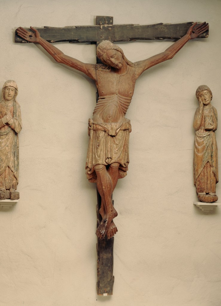
Corpus of Christ (13th century), artist unknown [Spain]
Angelina Giulianelli
I spent my time looking at the large wooden Corpus of Christ from the late 1200s, and honestly, it felt a lot heavier than I expected. At first glance, it’s just a crucifix, something I’ve seen my whole life growing up Catholic. But standing there for a full ten minutes, it started to remind me of how powerful and significant it is. The longer I looked, the more human Christ seemed. His body isn’t perfect or idealized. It’s stretched, worn, almost fragile. That made it harder to just walk past it the way I normally would.
What really stayed with me was how physical it felt. The carving, the weight of the body, the way it hangs, it makes the suffering feel real, not just symbolic. It made me think about how in medieval Europe, especially in Northern Italy, this wasn’t just art. It was something people experienced deeply, almost like a direct connection to Christ’s sacrifice. Being in the European collection, and being Sammarinese myself, made it feel even more personal, like this wasn’t distant history but part of something I come from.
John Berger says every image embodies a way of seeing, and this one feels rooted in reverence and reality. But it also made me question why that way of seeing feels so distant now. Why has something this powerful become so normalized? It’s like people forget the purity and significance behind it. It’s not just a cross. You see people wearing crucifix necklaces/jewelry just for the aesthetic, or living in ways that completely go against what it represents. Standing there, I couldn’t ignore the disconnect. It left me wondering when that shift happened, and what it would take to actually see it the way it was meant to be seen again.
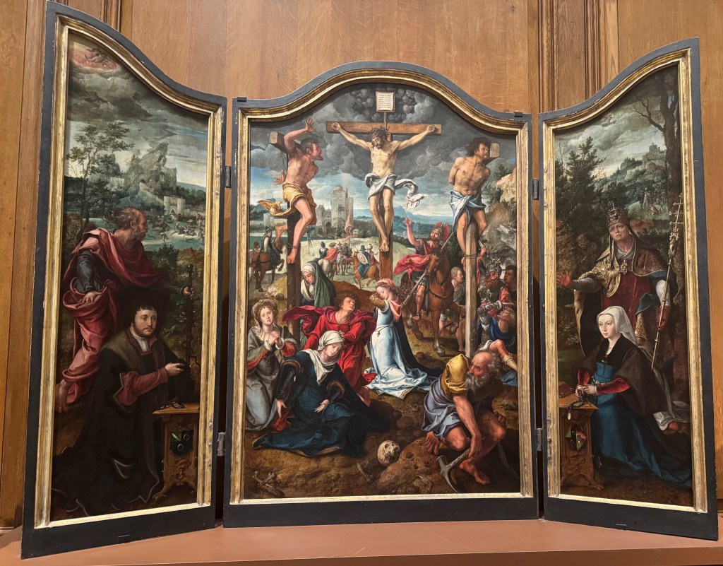
Triptych of the Crucifixion (16th century) by Pieter Coecke van Aelst
Tara Miyo
I’m definitely cheating a bit since the assignment was to pick one piece of art, but I really couldn’t pick my favorite, and narrowing it down to just two was pretty hard as well.
I really loved the rooms that showcased art made to represent the last supper and the crucifixion and the holy family. I think one of the best parts of my life is being Catholic and being able to see work dedicated to my faith is an out of body experience for me.
I think the cross [Corpus of Christ] is one of my favorite pieces of art because it is so detailed and old. I think being able to salvage a sculpture from the 1200s is insane. I also just really loved that the sculpture wasn’t perfect. It had racks and pieces of the feet were missing, but the way it felt to walk into the room and see the cross on the back wall was amazing. It felt like I was being pulled into the work (although it sounds kind of corny to say that).
The Triptych is such a gorgeous painting, and I had to include it because it reminds me so much of the art that is on display at my church and so many others that I’ve been to. I think trying to replicate something that happened so long ago is a big challenge, but the level of detail in this painting just blew me away. And I loved how despite all the chaos I was again drawn to the cross and the way Jesus is displayed as front and center but not in a loud way, if that makes sense.
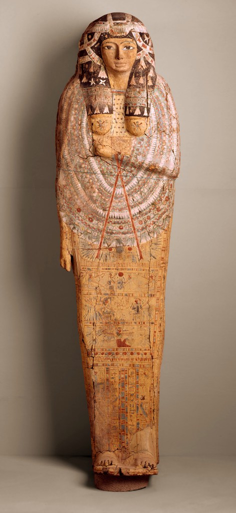
Mummy Case (between 950 and 850 BCE), artist unknown [Egypt]
Yasmeen Sokol
This was a great trip. I’ve been to the DIA a couple of times before in high school with my art classes, but this time felt different because I actually slowed down and focused on one object. I chose the Egyptian mummy case.
At first, I thought I understood what I was looking at pretty quickly . . . just a decorated coffin. It felt familiar in a way that made me assume there wasn’t much more to notice at first. But standing there longer made that feel wrong.
The patterns aren’t just random decorations. The section across the chest especially stood out because it felt almost crowded compared to the rest, like everything was being pulled toward the center. I also didn’t expect how flat it would feel in person. It looks detailed, but not in a way that pops out. It’s more controlled and contained, which made me look closer instead of just glancing at it.
I kept going back to the face, but not because it was expressive. It actually felt the opposite, almost like it was trying not to show anything at all. That made it harder to read, and I think that’s what kept my attention the longest.
Honestly, if I looked at everything in the museum this closely, I’d be there all day! But this Egyptian mummy case truly made me realize how fast I usually move past things. It left me wondering if I only started noticing more because I forced myself to stand there, or if there are things I still completely missed anyway. I also started thinking about whether seeing it behind glass changes what I notice, and if I’d experience it differently in a completely different setting.
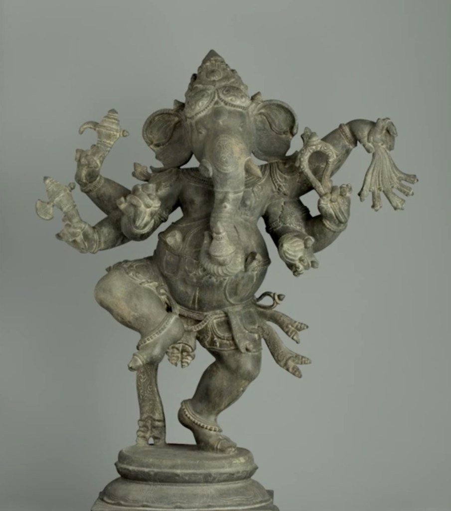
Ganesha (17th–18th centuries), artist unknown [India]
Zak Abdalla
Ganesha. This Hindu sculpture struck me immediately as I walked through the door. It almost felt as if it called me to it. I was so infatuated with it, the detail that went into Ganesha, the items it held, the almost trippy vibe it had. I loved it. I probably stared into its eyes for five minutes before I actually processed the rest of it. I felt so spiritual and almost felt as if my soul was touched by this little sculpture.
As I started to read around it. It made sense. This eye contact I held and felt is a thing Hindus call “darshan.” The description reads: “Darshan is not about admiring these figures as works of art. Rather, many Hindus believe that the god or goddess is present within its image. Beholding the sculpture is how believers see and are seen by god.”
I was astonished when reading this because I literally had just felt what the plaque was describing. Then it got weirder.
The second plaque describes what the god Ganesha means to the Hindu people. It says that Ganesha is the first god celebrated at times of transitions when you are entering a new chapter of your life. They say he offers protection and removes obstacles along the way. This really resonated with me, because this past year has been a really big transition for me, and now I’m about to go into an even bigger transition, so I don’t think my encounter with Ganesha was just by coincidence.
I genuinely am so touched by Ganesha and the beauty of this sculpture. What I felt was almost indescribable. Christians might refer to this feeling as the work of the Holy Spirit. Very different, perhaps, but this is the best way I can describe the way I felt.
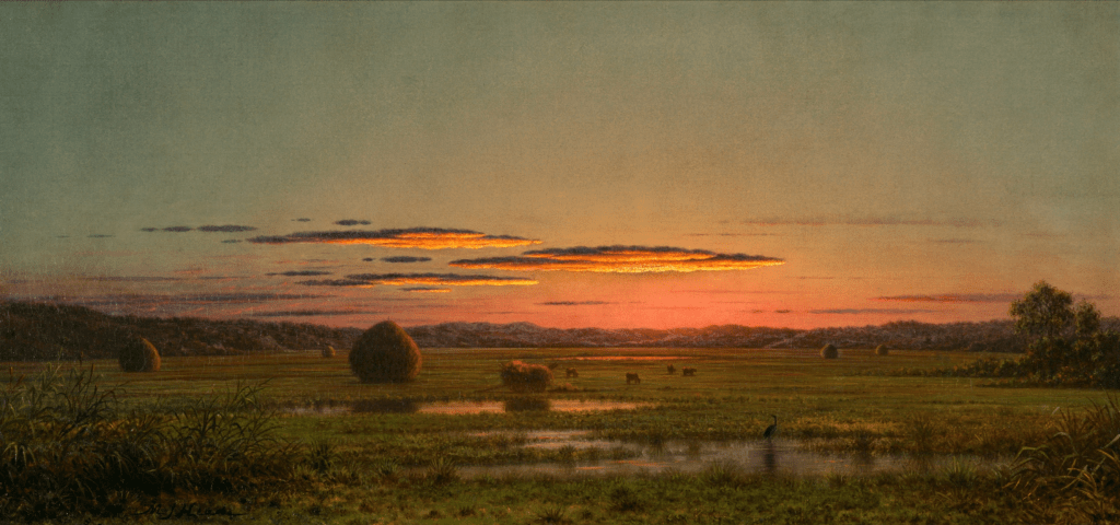
Sunset (ca. 1880) by Martin Johnson Heade
Hannah Burdinie
I spent a while just standing in front of this painting, and the first thing that really settled in was how quiet it felt. The sky is low and warm, and everything in the landscape feels like it’s slowing down with the light.
It reminded me immediately of home. More specifically the feeling of coming back after being away for awhile. The longer I looked at it, the more it evoked my senses. I can imagine being in this place, hearing the mourning doves sing and the world settling into itself for the night. The water, the fields, the cattle, all at rest.
I often feel like realistic paintings get a bad wrap. The discussion is always based around technique, never feeling. Standing there, it didn’t feel that way at all. The painting pulled at everything—sight, memory, sound, temperature, even.
I left wondering why certain images can hold such a feeling, and how something so simple can feel so complete.
Students in the University Honors Program also took part in this visit to the DIA, though they weren’t required to complete the assignment. Professor Molly Barlow, who is both the Honors Program Coordinator and a short-story writer, decided that she would give it a shot, too:
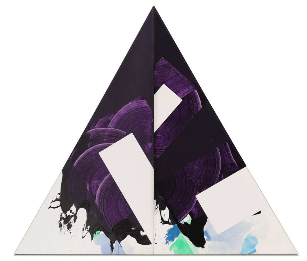
Plum Nellie (1972) by Robert Reed
Molly Barlow
The punchline is: I really don’t know.
My understanding of art rates about level with my understanding of poetry: you can deconstruct it, explain every brushstroke / iamb, delve into what the artist / poet was thinking / feeling / being when he / she / it / they / xe painted / sculpted / constructed / wrote the item in question, and my response is still likely to be something along the lines of, “If you say so.” I’m game to try, though, to have a look at whatever and try to understand it. That was my challenge today.
The purple didn’t strike me so much as the pyramid design did. It’s different. It stands out. It’s avant-gardesque. (It also did not have a bench to sit on to observe it in comfort. The request was to observe the artwork for 10 minutes, which I spent in vajrasana in front of it instead of standing.) The purple, solid at the top and then in sweeping brushstrokes below, suggested something as American as can be: purple mountains majesty. It was not above a fruited plain; rather, the exposure of white with blue tinges along the bottom suggested cloud cover, as if this mountain was reaching into the stratosphere. It had — has, I guess — aspirations. As do I.
But I did try, to look, to feel, to understand. And this work, this mostly purple triangle, this said something to me. But what? What did it say? Why did I spend 10 minutes kneeling in front of it? What was I trying to prove, and to whom?
I really don’t know.
General admission to the Detroit Institute of Arts (DIA) is always FREE for residents of Wayne, Oakland, and Macomb counties. https://dia.org/

Leave a comment